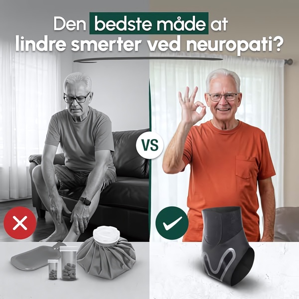
A split-screen comparison showing a patient struggling with traditional pain relief methods versus the positive outcome of using a specialized compression sleeve.
Free credits included. No card required
This neuropathy compression sleeve ad creative uses a high-contrast split-screen to immediately visualize the core pain point versus the product solution. By pairing a desaturated, negative user experience on the left with a warm, optimistic image on the right, the creative taps into the viewer's desire for immediate relief without complex medical jargon. The clear visual juxtaposition serves to instantly communicate product utility and build consumer trust before the viewer even reads the headline.
For most performance teams, this type of clear differentiation is key to overcoming scroll-fatigue in health-related categories. When you use Promer AI to analyze these winning patterns, you can see how simplified messaging combined with a strong, emotional user state drives higher click-through rates. This strategy relies on the audience identifying their current struggle and quickly seeing a path to their ideal state.
Great ads start from a clear structure that maps the user's journey from their daily frustration to your specific solution.
Pro tip
When testing comparison ads, ensure the product being compared as 'negative' is something your audience is currently using or aware of. This makes the transition to your product feel like a logical, necessary upgrade rather than a random sales pitch.




















Promer helps you find the pattern, adapt it to your product, and create your own version in minutes.






