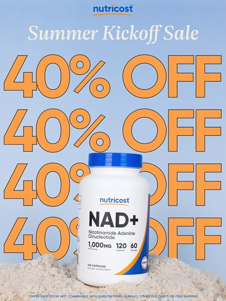
A high-contrast promotional creative featuring a bottle of NAD+ supplements centered in sand against a blue summer-themed background, utilizing bold text overlays.
Free credits included. No card required
This NAD+ supplement ad creative succeeds by stripping away visual clutter to force focus on a massive discount. The core strategy uses repetitive, oversized typography as a graphical element to communicate the offer urgency before the viewer even processes the product details. By pairing the vibrant orange discount text with a clean blue and sand-themed background, the design creates a distinct 'summer' association while maintaining a high-contrast readability that is essential for mobile feeds. Utilizing the tools inside Promer AI can help teams replicate this minimalist structure effectively. This pattern works well for most supplement brands as it leverages the high-intent nature of a discount to stop the scroll. The composition places the product prominently in the foreground, ensuring that brand recognition happens instantly upon the initial impression.
Great ads start from an idea, a feeling, or a structure, not a blank design.
Pro tip
When using repetitive text, ensure the most important information is at the visual center of the ad. If your product packaging is simpler than this NAD+ bottle, consider using a high-quality lifestyle shot instead of the static product render to increase perceived value.




















Promer helps you find the pattern, adapt it to your product, and create your own version in minutes.






