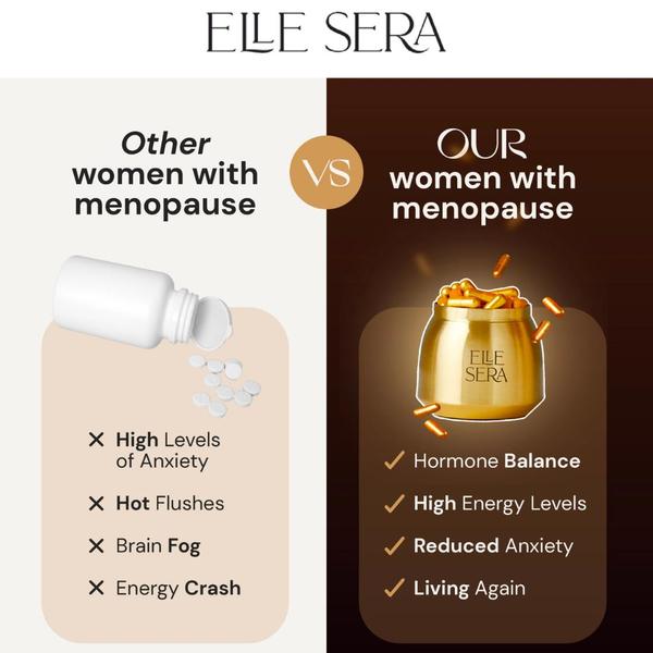
A split-screen comparison ad creative contrasting generic supplements against this specific brand to highlight symptom relief.
Free credits included. No card required
This menopause supplement ad creative uses a high-contrast comparison framework to immediately position the product as a superior solution. The split-screen layout forces a side-by-side evaluation that cognitively separates the 'old way' of managing symptoms from the benefits of this specific supplement. By visually stripping away the chaos of generic symptom management and replacing it with a clean, aspirational 'living again' narrative, the design taps into the pain points of the target audience with surgical precision. Using Promer AI to analyze these comparative layouts can help brands identify the precise balance of negative and positive visual triggers required to drive clicks in sensitive health categories. For most ecommerce teams, this structure provides a repeatable template for establishing brand authority by clearly defining the 'before' and 'after' states for the customer.
Great ads start from an idea, a feeling, or a structure, not a blank design.
Pro tip
When using a comparison framework, ensure your 'us' side avoids jargon and uses emotional language like 'living again' to contrast with the functional clinical symptoms listed in the 'them' column. This emotional shift is often the primary driver of conversion in health-related supplement ads.




















Promer helps you find the pattern, adapt it to your product, and create your own version in minutes.






