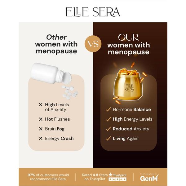
A split-screen comparison ad creative for menopause supplements, showcasing the negative side effects of generic alternatives against the positive benefits of the featured brand.
Free credits included. No card required
This menopause supplement ad creative uses a high-contrast split-screen layout to frame the brand as the clear solution against generic market alternatives. The Us vs Them comparison strategy works by placing the viewer’s current pain points directly against the desired outcome of the product. This approach leverages visual negative versus positive reinforcement to guide the customer toward an immediate mental choice.
For most ecommerce teams, this structure effectively clarifies the value proposition without requiring complex storytelling. You can replicate this structural clarity with Promer AI to test different benefit-led claims. It is essential to ensure that your specific product features are clearly distinguishable from the status quo to maintain audience trust.
A powerful ad creative does not need to be complex; it simply needs to show the user exactly where they are and where they could be.
Pro tip
When using a comparison hook, ensure the 'Other' side lists symptoms that your audience experiences daily to maximize relevance. Use the right side to focus on emotional benefits rather than just ingredient lists to increase the likelihood of a conversion.




















Promer helps you find the pattern, adapt it to your product, and create your own version in minutes.






