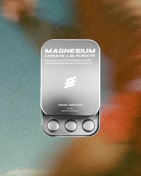
A high-contrast, minimalist studio shot of a metal magnesium supplement tin against a textured, blurred background.
Free credits included. No card required
This Magnesium Supplement ad creative succeeds by stripping away visual clutter to focus entirely on product authority and clarity. By utilizing a high-contrast studio aesthetic and a centered composition, the brand effectively commands attention in crowded social feeds, relying on the visual weight of the metal packaging to signal premium quality and efficacy.
The strategy hinges on combining a clear benefit-driven headline with an aspirational, clean visual language. This approach works for most ecommerce teams because it reduces cognitive load for the consumer, allowing the text to directly address pain points like muscle tiredness. You can leverage Promer AI to analyze similar high-converting layouts for your own health products.
A minimalist visual is only as strong as the clarity of the product benefit it supports.
Pro tip
When using a high-contrast minimalist style, ensure your typography remains highly readable against the metallic finish of the product. Test a version with a slightly more saturated background color if your current creative is getting lost in low-light mobile displays.




















Promer helps you find the pattern, adapt it to your product, and create your own version in minutes.






