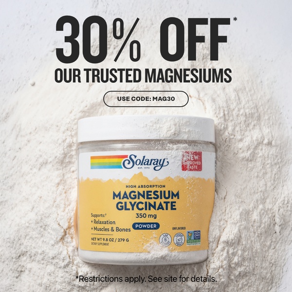
A clean, minimalist product-focused ad featuring a container of magnesium powder set against a white, texture-rich background with a clear discount overlay.
Free credits included. No card required
This Magnesium Glycinate ad creative leverages a high-contrast discount hook to capture attention instantly, utilizing a clean, minimalist layout that keeps the focus entirely on the product. The strategy relies on a clear, value-driven offer that speaks directly to price-conscious consumers. By placing the "30% OFF" headline in bold, high-contrast typography, the ad creates an immediate sense of urgency while maintaining a professional and trustworthy brand aesthetic.
In most cases, for supplement brands, this simple structure performs well because it removes visual clutter and lets the product packaging do the heavy lifting. Using Promer AI to analyze such patterns helps you understand why direct, unadorned offers often outperform busy designs. For most ecommerce teams, testing this layout against more complex lifestyle images can reveal if your audience responds better to pure value propositions or visual storytelling.
Great ads start from a structure that aligns your core offer with your product's most essential visual identity.
Pro tip
When running discount-heavy creative, ensure the secondary text—like your discount code or site details—is legible at smaller sizes. For a product-subject like this, testing a variation where the powder texture is slightly adjusted in post-production can prevent creative fatigue while maintaining your core brand look.




















Promer helps you find the pattern, adapt it to your product, and create your own version in minutes.






