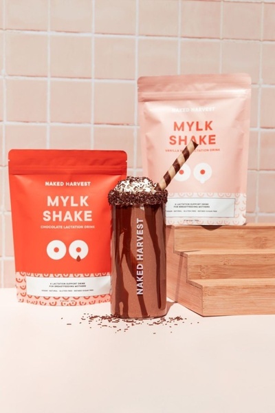
A clean, studio-lit shot of two product bags flanking a chocolate lactation shake, utilizing a consistent soft-pink and vibrant orange color palette.
Free credits included. No card required
This lactation support drink ad creative uses a high-contrast, symmetrical layout to establish immediate brand recognition. By centering the prepared product between the raw packaging, the creative anchors the viewer on both the aesthetic appeal and the tangible result, effectively reducing friction during the awareness phase.
This approach works because it leverages the psychological power of clean, uncluttered visuals to communicate purity and quality. Using Promer AI to replicate this symmetrical balance allows ecommerce teams to present their product lineup as a cohesive lifestyle system rather than just isolated items, which typically improves brand recall in crowded social feeds.
Great ads start from an idea, a feeling, or a structure, not a blank design.
Pro tip
When focusing on appetite appeal, ensure your lighting highlights the texture of the product toppings to trigger an immediate sensory response. This technique effectively moves the product away from a clinical health framing and toward an indulgent, enjoyable daily habit.




















Promer helps you find the pattern, adapt it to your product, and create your own version in minutes.






