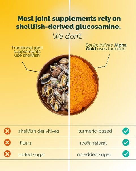
A split-screen comparison visual that contrasts traditional shellfish-based joint supplements with a modern, turmeric-based alternative.
Free credits included. No card required
This Joint Supplement ad creative effectively captures attention by presenting an immediate, high-contrast visual conflict between the common market standard and the brand's unique formulation. By leveraging a clear Us vs. Them framing, the creative simplifies a complex health decision into a binary choice, allowing the consumer to identify with the 'turmeric-based' solution instantly.
This pattern functions well for product categories where ingredient transparency is a core purchase driver for most ecommerce teams, as it bypasses the need for long-form explanation. You can iterate on this structure using Promer AI to test different ingredient claims against your own primary target audience, helping you maintain a consistent brand voice across your ad assets.
Great ads start from an idea, a feeling, or a structure, not a blank design.
Pro tip
When using a comparison framework, ensure your 'Us' side focuses on the most desired benefit for your niche. In the context of supplements, pairing visual textures—like the raw ingredient contrast seen here—creates a more tactile and credible narrative than text alone.




















Promer helps you find the pattern, adapt it to your product, and create your own version in minutes.






