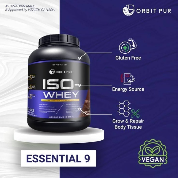
A 1:1 ratio creative that uses a clear product shot with directional lines to explain core benefits like gluten-free status and energy source properties.
Free credits included. No card required
This ISO Whey protein ad creative uses a clean, infographic-style layout to immediately associate physical product attributes with health-focused benefits. By using direct directional lines to anchor benefits to specific aspects of the packaging, the brand eliminates consumer confusion and establishes immediate trust. This structure works well for complex or ingredient-heavy products where the customer needs to quickly grasp the value proposition without reading long-form text blocks.
For most ecommerce brands, this format is highly effective because it simplifies the decision-making process during a fast-paced scroll. You can replicate this clear, educational structure using Promer AI to highlight your own product's unique selling points. By focusing on visual clarity, you allow the core benefits to do the heavy lifting in your campaign performance.
Great ads start from an idea, a feeling, or a structure, not a blank design.
Pro tip
To increase the perceived value of your supplement, ensure that your benefit callouts align with specific certifications or health-related outcomes. Use high-contrast icons to break up text-heavy sections, as these visual anchors improve retention for skimmers in mobile feeds.




















Promer helps you find the pattern, adapt it to your product, and create your own version in minutes.






