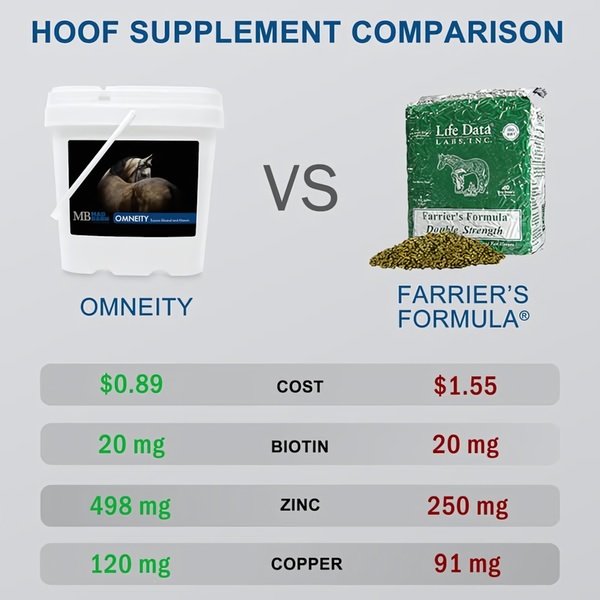
A split-screen comparison ad featuring Omneity vs. Farrier's Formula with direct cost and nutrient breakdown.
Free credits included. No card required
This hoof supplement ad creative uses a high-contrast comparison chart to cut through visual noise by presenting raw, undeniable product data. By framing the value proposition as a direct side-by-side 'Us and Them' comparison, the ad forces the customer to focus on cost-per-benefit metrics rather than subjective brand preferences.
For most ecommerce teams, this pattern works because it appeals to the rational side of the buyer's journey, especially for specialized products where ingredient efficacy matters. You can build your own version of this analytical layout using Promer AI to structure your product highlights and key specs into a high-converting comparison asset.
Great ads start from a logical structure that makes the buying decision easier, not from a complex design.
Pro tip
When using a comparison hook, ensure the specific nutrients or price points you highlight are the ones your target audience is already searching for. Avoid overwhelming the viewer with too many rows; stick to the three most critical differentiators that drive your conversions.




















Promer helps you find the pattern, adapt it to your product, and create your own version in minutes.






