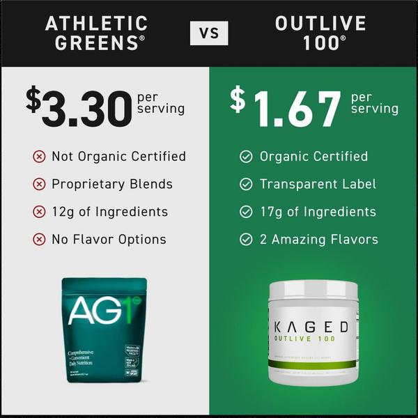
A split-screen comparison table highlighting the price per serving, ingredient quality, and transparency differences between two competing green supplement powders.
Free credits included. No card required
This green supplement ad creative utilizes a classic 'Us vs Them' framing to simplify a complex purchase decision for the consumer. By presenting a clear, side-by-side comparison table, the brand establishes an immediate value proposition that prioritizes transparency and cost-efficiency over abstract health benefits.
For most ecommerce teams, this structured visual pattern provides a reliable way to differentiate your product from established category leaders. When you use Promer AI to model this format, you can shift the focus toward your specific technical advantages, such as ingredient sourcing or cost-per-serving, which helps move skeptical prospects down the funnel more effectively.
Great comparison ads are built on specific, verifiable metrics that guide the consumer to a logical conclusion rather than an emotional guess.
Pro tip
When creating a comparison table, keep your row labels consistent so the viewer can easily scan across for specific features. Only include attributes where your product holds a definitive advantage, and use clear, universally understood icons to reinforce your winning claims.




















Promer helps you find the pattern, adapt it to your product, and create your own version in minutes.






