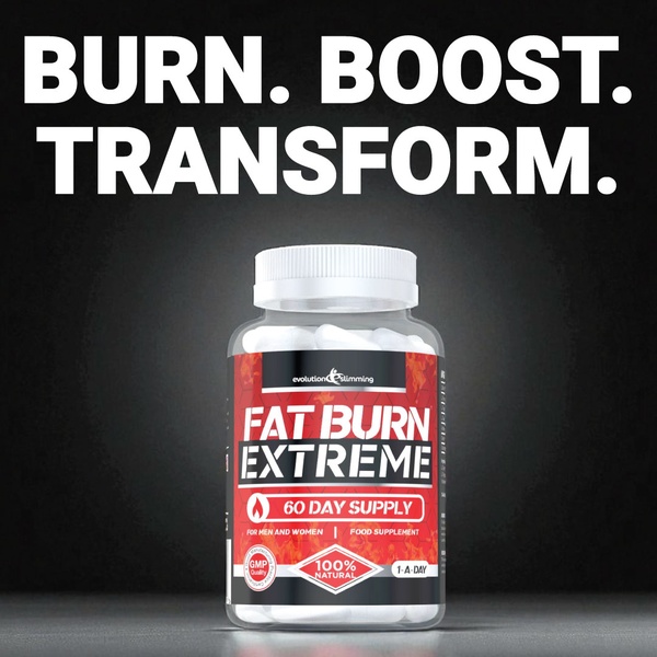
A high-contrast, product-centric ad creative for a fat burner supplement featuring bold typography on a black background.
Free credits included. No card required
This fat burner supplement ad creative utilizes a minimalist, high-contrast aesthetic to command immediate attention in a crowded feed. By placing the core value proposition in bold, upper-case typography against a stark black background, the brand effectively separates the product from peripheral visual noise and focuses the viewer entirely on the transformation promise. The strategic use of extreme contrast makes the product bottle the primary visual anchor after the reader consumes the hook.
Adopting this structural approach allows ecommerce teams to clearly communicate their brand promise without requiring complex motion graphics. By using Promer AI to refine the visual hierarchy of your product, you ensure that the text-to-visual ratio serves the primary call to action. In most cases, this pattern works because it treats the supplement bottle as a high-authority asset that reinforces the bold textual claims.
Great ads start from a clear value proposition and a visual structure that directs the eye exactly where you want it to land.
Pro tip
For supplement ads, ensure the callout icons on your packaging are as readable as your headline. If your product label is visually busy, simplify the background by using a dedicated studio-quality shot to ensure the label details do not clash with the primary hook.




















Promer helps you find the pattern, adapt it to your product, and create your own version in minutes.






