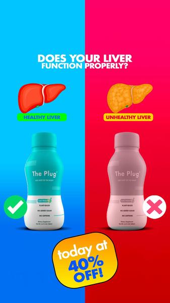
This creative uses a split-screen approach to contrast a healthy liver against an unhealthy one, positioning the product as the solution for proper liver function.
Free credits included. No card required
This electrolyte supplement ad creative leverages a classic Us vs. Them framing to instantly categorize the viewer's health status. By visually contrasting a healthy liver with an unhealthy one, the creative forces a quick emotional decision that makes the product solution appear necessary and immediate for the user.
This binary design pattern is highly effective in most cases because it bypasses complex explanations, providing a clear, visual reason to purchase. Using Promer AI allows performance teams to replicate this structure with their own product assets, maintaining the same clean, high-contrast aesthetic that stops the scroll on mobile feeds.
Effective direct-response ads simplify the path to purchase by clearly illustrating the gap between the customer's current pain and the brand's solution.
Pro tip
When testing comparison ads, ensure your secondary 'negative' visual remains medically accurate but simplified for rapid comprehension. Pairing this with a clear, time-sensitive offer like the 40% off featured here can help drive higher click-through rates by lowering the barrier to entry.




















Promer helps you find the pattern, adapt it to your product, and create your own version in minutes.






