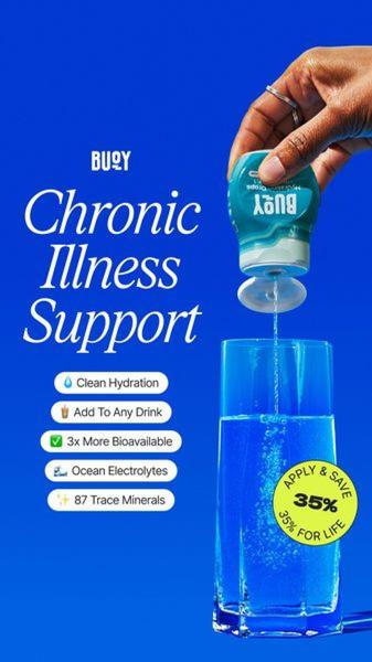
This 9:16 vertical creative highlights the functional benefits of electrolyte drops using a high-contrast blue background, bold white typography, and a clear call-to-action.
Free credits included. No card required
This electrolyte drops ad creative employs a clean, high-contrast visual strategy that immediately signals functional relief to the viewer. By pairing a bold, clear headline stating the exact pain point with a stack of value-driven bullet points, the brand effectively converts complex product science into an easily digestible list of benefits. The core strategy here is to leverage psychological urgency through high-contrast typography and a clear, time-sensitive incentive.
For most performance teams, this pattern works because it prioritizes readability and direct messaging on mobile-first placements. By utilizing Promer AI to analyze these structural choices, advertisers can ensure their own product value is communicated with the same level of clarity and visual hierarchy, which typically helps in reducing churn and improving click-through rates in competitive health niches.
A high-converting ad does not rely on noise, but on the disciplined arrangement of product benefits against a singular, resonant problem.
Pro tip
To boost engagement, match your background color to the most dominant or psychologically appealing color associated with your product category, as seen in this blue-themed design. Use the negative space around the product and text to allow the eye to rest, ensuring the most important benefit is read first.




















Promer helps you find the pattern, adapt it to your product, and create your own version in minutes.






