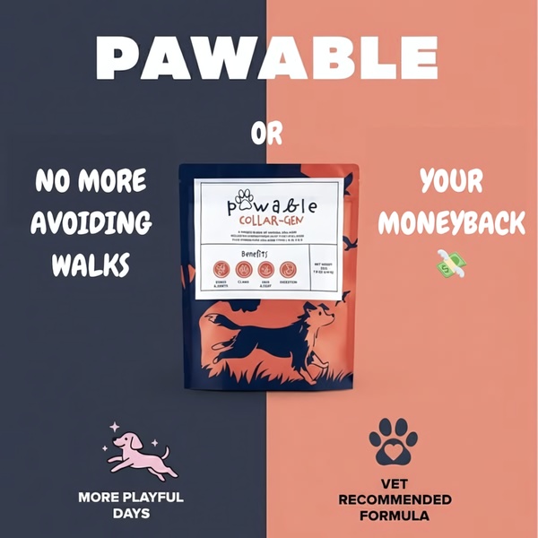
A 1:1 ratio ad creative featuring a direct split-screen layout contrasting the pain of avoiding walks with the benefit of the supplement.
Free credits included. No card required
This dog joint supplement ad creative succeeds by utilizing a high-contrast, split-screen visual structure that immediately signals a clear transition from pain to resolution. By framing the product as a bridge between the frustration of sedentary lifestyle and the joy of movement, the design creates a psychological anchor that viewers grasp in milliseconds. The primary strength of this layout is the binary choice presented to the user, forcing them to align with their desired outcome.
For most ecommerce teams looking to optimize their visual narrative, this pattern works because it removes cognitive load, allowing the Promer AI platform to help scale variations that emphasize different pain points. A clear, bifurcated visual path helps potential customers rapidly process the value proposition without needing extensive copy to explain the function of the supplement.
Great ads start from an idea, a feeling, or a structure, not a blank design.
Pro tip
When testing a split-screen design, try swapping the emotional benefit on the left with a social proof element like a 5-star review. This often identifies whether your audience is more motivated by avoiding a negative outcome or achieving a positive emotional state.




















Promer helps you find the pattern, adapt it to your product, and create your own version in minutes.






