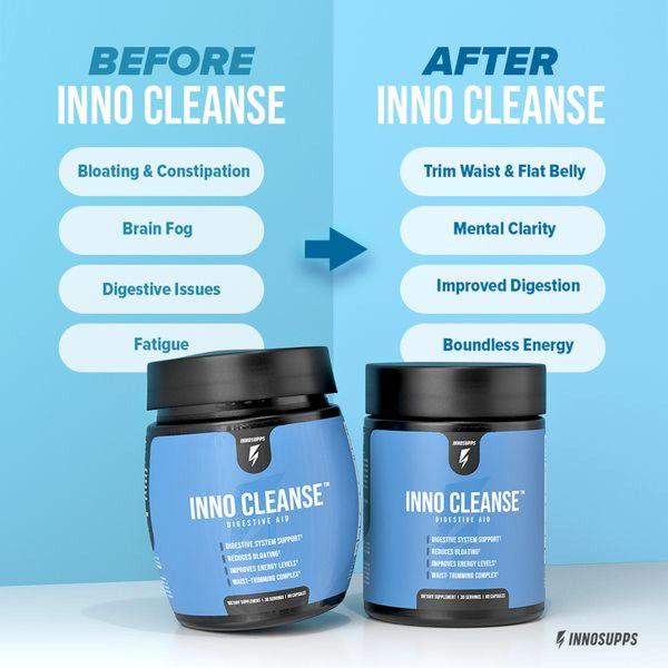
A split-screen educational graphic contrasting symptoms of poor digestive health with the positive outcomes of using a supplement.
Free credits included. No card required
This digestive aid ad creative succeeds by utilizing a stark, split-screen before-and-after format that makes the benefits of the product immediately readable to the viewer. By clearly contrasting the negative symptoms of digestive distress against the aspirational state of improved health, the design lowers the cognitive load required for the prospect to understand the value proposition.
This pattern works effectively for most ecommerce teams because it anchors the product directly in a problem-solution loop, providing an logical emotional bridge for the customer. Using Promer AI to mirror this high-contrast, text-heavy layout allows marketers to quickly test different messaging variations while maintaining a clean, professional aesthetic that builds trust for health-focused products.
A great advertisement starts from a clear structural idea that maps the customer's journey from their current pain to their desired future outcome.
Pro tip
When using this split-screen approach for health products, ensure your 'before' symptoms are relatable but not overly clinical, while your 'after' benefits remain tangible. A common mistake is using generic benefits, but focusing on specific, measurable changes will significantly increase the stopping power of your creative.




















Promer helps you find the pattern, adapt it to your product, and create your own version in minutes.






