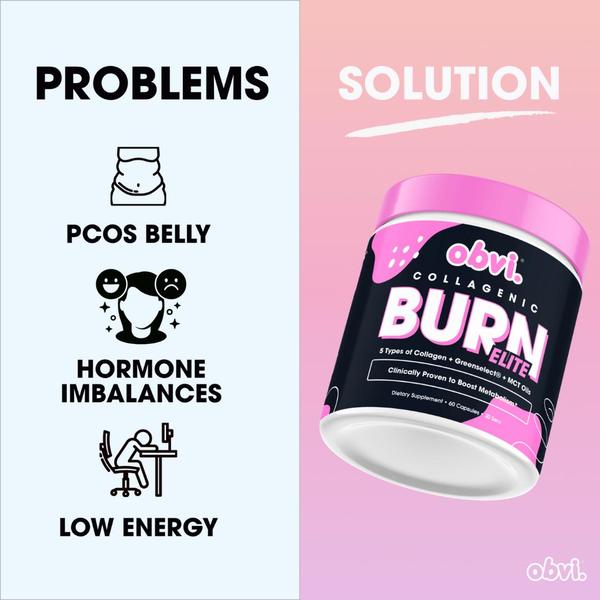
A split-screen graphic contrasting common consumer pain points with the brand's product as the solution.
Free credits included. No card required
This dietary supplement ad creative uses a high-contrast split-screen design to immediately categorize customer pain points against the brand's solution. By aligning the visual layout to a 'Problems' vs 'Solution' framework, the ad forces the viewer to acknowledge their specific discomfort before presenting the product as the inevitable relief.
This structure effectively reduces friction for the user by turning a complex health narrative into a simple, binary choice. For most ecommerce teams, creating such clear value propositions can be accelerated using Promer AI to maintain this aesthetic rigor across multiple product lines or variations without reinventing the layout.
Great ads start from an idea, a feeling, or a structure, not a blank design.
Pro tip
When using a split-screen layout, ensure the problem side remains minimalist to avoid cognitive overload. Your product image on the solution side should act as the 'hero' by using a high-quality cutout that stands out against the secondary background color.




















Promer helps you find the pattern, adapt it to your product, and create your own version in minutes.






