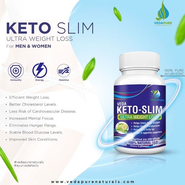
This static dietary supplement ad uses a clean white-space layout, benefit icons, and a high-contrast hero image to communicate value.
Free credits included. No card required
This dietary supplement ad creative leverages a clean, high-contrast layout that prioritizes scannable benefits through clear iconography and a professional, science-backed aesthetic. By pairing the product subject with a list of seven distinct health markers, the brand establishes authority without overwhelming the viewer. The core strategy relies on the immediate visual translation of complex health claims into simple, digestible bullet points.
Adopting this clean, benefit-forward layout for your own supplement brand helps minimize cognitive load for potential customers, allowing them to instantly grasp the value proposition. You can easily replicate this structure within Promer AI to test different benefit combinations against your specific audience segments. In most cases, these structured, informative grids perform better than cluttered lifestyle imagery for new product introductions.
A winning creative structure relies on the balance between clear, readable benefits and a clean, authoritative visual identity.
Pro tip
Instead of listing all seven benefits like this example, test a variation that highlights only your top three competitive differentiators. Keeping the bullet points limited to three can often increase the click-through rate by focusing the user's attention on your strongest hook.




















Promer helps you find the pattern, adapt it to your product, and create your own version in minutes.






