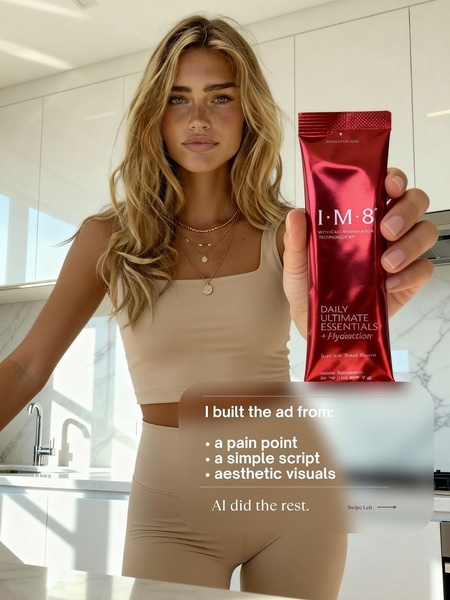
A clean, high-aesthetic visual featuring a person holding a branded supplement packet with minimal text overlay.
Free credits included. No card required
This Daily Supplement ad creative excels by pairing a high-trust visual aesthetic with a clear, benefit-oriented value proposition that respects the viewer's scroll time. By utilizing clean, high-key lighting and a neutral color palette, the brand establishes immediate authority while letting the physical product take center stage. This minimalist structure allows the ad to communicate a clear narrative through limited text, preventing cognitive overload and maintaining visual appeal.
Adopting this pattern for your own creative helps bridge the gap between aspirational branding and performance-driven direct response. By using Promer AI, you can replicate this clean, product-first layout while testing different hook variations to see which pain points resonate most with your specific audience. In most cases, keeping the visual clutter low helps improve retention rates for supplement products where brand trust is the primary conversion driver.
Great ads start from an idea, a feeling, or a structure, not a blank design.
Pro tip
When running minimalist ads, ensure the product packaging itself is the hero of the image. The contrast between the bold red packaging and the neutral background in this example is exactly what drives the visual thumb-stop.




















Promer helps you find the pattern, adapt it to your product, and create your own version in minutes.






