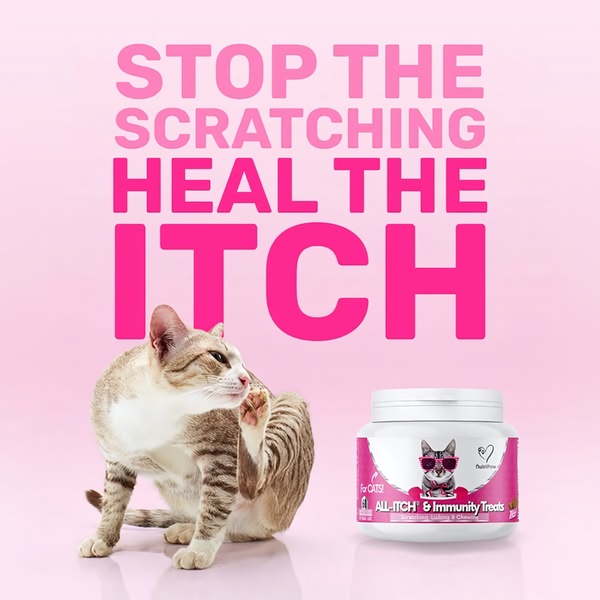
A high-contrast 1:1 square graphic for cat allergy treats, featuring a clear pain-point headline and product imagery against a soft pink background.
Free credits included. No card required
This cat treats ad creative succeeds by pairing a direct, high-contrast pain-point hook with a clean visual representation of the relief. By utilizing bold typography that occupies nearly half the frame, the design forces the viewer to confront the specific issue—scratching—before offering a clear, professional-grade solution that validates the consumer's need for an immediate answer.
Applying this pattern allows brands to cut through the scroll by validating the user's frustration instantly. When you leverage Promer AI to replicate this structure, you ensure your product occupies the secondary visual anchor point while maintaining a consistent color palette that reinforces brand authority. For most ecommerce teams, focusing on the problem before the product often leads to higher engagement rates, though results will vary based on your specific audience's pain points.
Great ads start from an idea, a feeling, or a structure, not a blank design.
Pro tip
When using a direct pain-point hook, test variations where the product image shows a close-up of the benefit or the ingredient list. Ensure the color of the text matches the secondary brand color to keep the visual hierarchy clean while maintaining the strong, authoritative voice of the original design.




















Promer helps you find the pattern, adapt it to your product, and create your own version in minutes.






