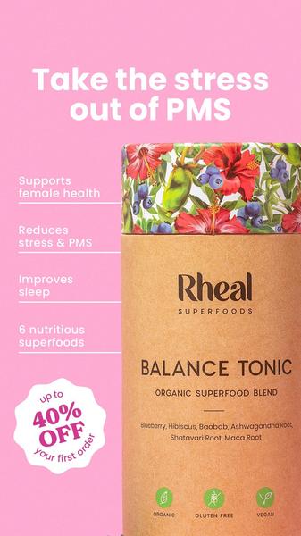
A vertical 9:16 ad creative highlighting core product benefits and ingredient callouts through a clean, color-blocked list format.
Free credits included. No card required
This Balance Tonic ad creative succeeds by pairing a clear, pain-focused headline with an easily skimmable benefit checklist. By mapping specific emotional and physical outcomes directly to the product's function, it reduces cognitive load for the viewer and builds immediate trust through a transparent ingredient list. This structure is a proven winner for supplement brands because it prioritizes clarity over clutter.
Such a design language works for most ecommerce teams because it mimics editorial content, which often feels less intrusive in a social feed. If you want to deploy a similar architecture for your own products, you can leverage Promer AI to maintain this level of brand consistency while testing multiple value-based angles. Depending on your product category, keeping the copy concise is key to maintaining high retention rates on mobile placements.
Great ads are built on the clarity of your core message rather than an overabundance of visual complexity.
Pro tip
When using a list-based hook, ensure each bullet point starts with a strong action verb to maximize the feeling of tangible results. Test variations where you switch the order of the benefits to see which pain point resonates most strongly with your specific audience segments.




















Promer helps you find the pattern, adapt it to your product, and create your own version in minutes.






