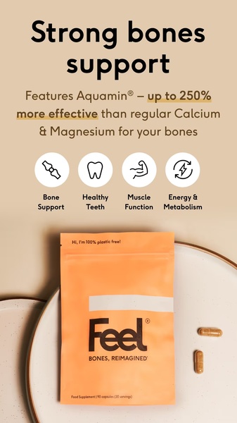
A vertical ad layout showcasing a supplement pouch with clear benefit icons, emphasizing scientific effectiveness over traditional alternatives.
Free credits included. No card required
This supplement ad creative leverages a data-driven hook paired with clean iconography to establish immediate credibility. By isolating a specific, quantifiable benefit—being 250% more effective than standard alternatives—it cuts through the noise of generic health claims to capture consumer attention via scientific validation. The core strength lies in its ability to translate complex health benefits into instantly digestible icons, reducing the cognitive load for potential customers while scrolling.
For most supplement brands, this structured approach is effective because it prioritizes clarity over clutter. Using Promer AI allows you to adopt this layout to highlight your own product's unique efficacy, ensuring your messaging remains focused on the specific problem your ingredients solve rather than just listing generic features.
Great ads start from a structural commitment to simplicity and clear value communication, not just a design that looks pretty.
Pro tip
When using comparative data hooks like 'up to 250% more effective', always ensure your claims are easily verifiable to build long-term brand equity. For a 9:16 vertical layout, keep your most important benefit icons centered to account for UI overlays on platforms like TikTok and Instagram.




















Promer helps you find the pattern, adapt it to your product, and create your own version in minutes.






