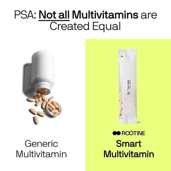
A split-screen, minimalist comparison graphic that positions a generic pill bottle against a personalized supplement packet.
Free credits included. No card required
This smart multivitamin ad creative utilizes a stark, binary visual layout to immediately force the viewer into an 'us vs. them' mental state. By placing a cluttered, traditional pill bottle on the left against a modern, sleek single-serve packet on the right, the brand creates a clear visual tension that signals superior product evolution. Using whitespace and bold typography, the creative eliminates noise, allowing the viewer to instantly grasp the value proposition of personalization over commodity.
For most supplement teams, this structural clarity is a high-converting pattern because it simplifies complex health decisions into one observable choice. You can use Promer AI to analyze the visual weight of these split-screen layouts for your own product line. The effectiveness of this approach typically relies on the sharp contrast between the 'generic' and 'smart' labels, framing the viewer's current routine as outdated compared to the suggested innovation.
The most effective ads win by simplifying your product advantage into an immediate, visual decision for the customer.
Pro tip
When testing comparison ads, swap the imagery on the left side to show different 'generic' pain points. This helps identify which specific frustration with traditional products triggers the highest click-through rate for your audience.




















Promer helps you find the pattern, adapt it to your product, and create your own version in minutes.






