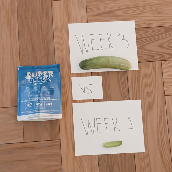
A minimalist visual comparison using handwritten signs and two cucumber slices to represent results from taking shilajit gummies.
Free credits included. No card required
This shilajit gummies ad creative employs a raw, lo-fi visual comparison to stop the scroll and immediately signal a transformation. By using the juxtaposition of a small slice versus a large cucumber, the brand communicates a 'growth' or 'result' narrative without needing high-production values or complex video editing.
The simplicity of this approach allows the viewer to project their own desired transformation onto the product. For most ecommerce teams, this type of minimalist visual shorthand provides a cost-effective way to test new hooks before investing in Promer AI high-fidelity assets. It works because it avoids the 'over-produced' look that often causes users to subconsciously classify content as an ad.
Great ads start from a singular, tangible idea of a transformation, rather than relying on complex graphic design.
Pro tip
When testing comparison ads, ensure the physical object used as a 'size reference' remains consistent in lighting and angle. Even in low-fi creative, the professionalism of the photography directly correlates with the perceived authority of the brand's health claims.




















Promer helps you find the pattern, adapt it to your product, and create your own version in minutes.






