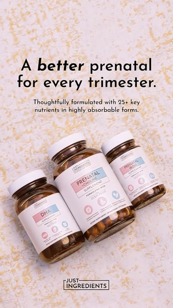
A clean, studio-lit display of three prenatal supplement bottles with bold benefit-focused text on a neutral, textured background.
Free credits included. No card required
This Prenatal Supplement ad creative leverages a direct benefit-led hook to establish immediate product authority. By focusing on the 'why'—better formulation and absorbability—the brand frames the product as a superior health choice rather than a commodity, using a clean, uncluttered visual layout to support a message of scientific trust. The key success factor here is the alignment of professional, soft-tone imagery with clear, concise copy that speaks directly to the primary user pain point.
Adopting this pattern of placing high-quality product imagery against a neutral, high-contrast text overlay helps maintain readability on mobile feeds. You can emulate this strategy by using Promer AI to analyze your own product assets, ensuring the visual mood matches the target audience's expectation for safety and quality. When executing this approach, keeping the text to a minimum—as seen in this example—typically yields higher performance by preventing cognitive overload in fast-scrolling environments.
A winning creative should prioritize the user's need for simplicity and trust by pairing high-fidelity product visuals with a single, sharp value statement.
Pro tip
To boost engagement on 9:16 mobile ads, ensure your product labels are legible at a glance. Even when the brand design is minimalist, testing variations with higher-contrast text overlays can often uncover significant improvements in click-through rates.




















Promer helps you find the pattern, adapt it to your product, and create your own version in minutes.






