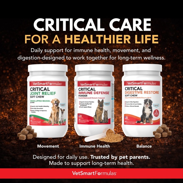
A high-clarity 1:1 square ad showcasing three distinct pet supplement products with clear benefit-led labeling for joint, immune, and digestive support.
Free credits included. No card required
This pet supplement ad creative succeeds by leveraging a clear, comparative visual structure that immediately signals authority and variety to the viewer. By placing the three primary wellness categories—movement, immune health, and balance—directly underneath their respective products, the brand minimizes cognitive load and allows pet parents to identify the solution relevant to their pet’s specific needs without extra friction.
Visual clarity in product-led creative acts as a trust signal, especially in the pet wellness category where efficacy is paramount. You can adopt this layout through Promer AI to test how different product groupings influence your click-through rates. In most cases, simplifying the hierarchy so that the 'what it does' is as prominent as the 'what it is' helps convert interest into higher intent, regardless of your specific pet product niche.
A clean layout that maps products to specific wellness outcomes is the fastest way to guide a customer from curiosity to consideration.
Pro tip
When showcasing multiple products, ensure the visual weight is balanced across the horizontal axis to prevent one product from cannibalizing the attention of another. You can also experiment with highlighting a single 'hero' product in the center and flanking it with secondary supplements to guide the user's purchase path.




















Promer helps you find the pattern, adapt it to your product, and create your own version in minutes.






