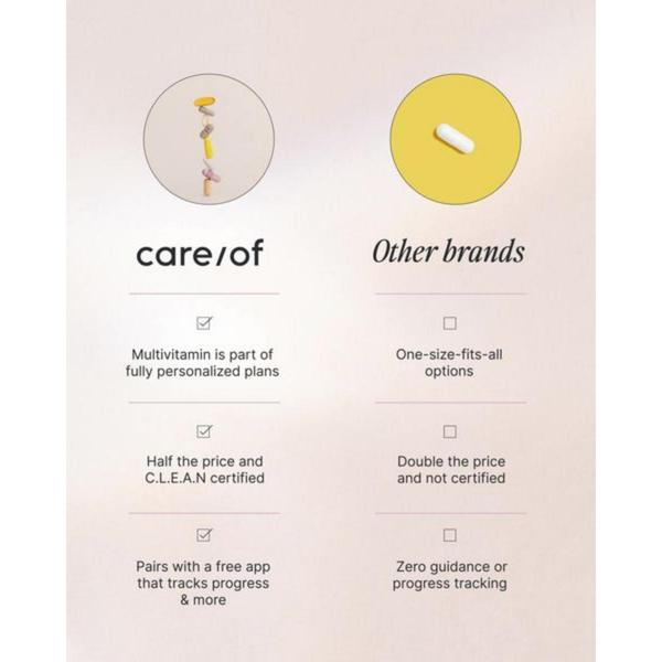
A side-by-side comparison chart illustrating the specific advantages of a personalized multivitamin plan versus generic industry alternatives.
Free credits included. No card required
This multivitamin ad creative utilizes a classic comparison chart to visually demonstrate competitive advantages. By framing the product against generic alternatives, the design forces the viewer to evaluate value directly, using clean iconography and bullet points to ensure readability is never sacrificed. The core strength of this layout is its ability to distill complex differentiation into an immediate, scannable format that builds trust with the viewer.
For most ecommerce teams, this structure is a highly effective way to explain a unique value proposition without overwhelming the user. You can leverage Promer AI to analyze your own product attributes and instantly map them into a similar comparison framework, ensuring your messaging resonates clearly in a crowded market.
A great comparison chart converts by making your unique value proposition the most obvious choice on the screen.
Pro tip
Keep your comparison points to exactly three to maintain viewer focus without causing cognitive load. Ensure your 'Us' column focuses on measurable benefits like tracking or certification to provide tangible proof points that justify a price or lifestyle shift.




















Promer helps you find the pattern, adapt it to your product, and create your own version in minutes.






