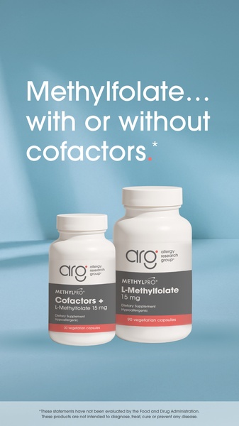
A clean, minimalist product shot comparing two variations of a Methylfolate supplement on a soft blue background.
Free credits included. No card required
This Methylfolate ad creative utilizes a direct, minimalist design to quickly communicate a specific product range extension. By leveraging a clean product comparison visual, the brand removes cognitive friction for the consumer, forcing the viewer to immediately address a binary choice between supplement options. The calm, monochromatic blue aesthetic builds authority and clinical trust while the oversized typography acts as an unmistakable billboard for the core message.
For most supplement brands, this simple structure is effective because it avoids lifestyle clutter that can distract from the functional value proposition. You can easily replicate this high-clarity layout using Promer AI to maintain your specific brand aesthetic while testing new product-focused messaging. This approach works best when you need to educate a sophisticated audience about specific product variations without overwhelming them with text.
Great ads start from a clear, simplified idea that guides the viewer toward a specific decision rather than drowning them in features.
Pro tip
When running product comparison ads, ensure your packaging labels are legible even at small scale. Since your hook is purely text-based, the visual weight of the bottles must support your headline by signaling the specific difference—like dosage or formulation—as clearly as possible.




















Promer helps you find the pattern, adapt it to your product, and create your own version in minutes.






