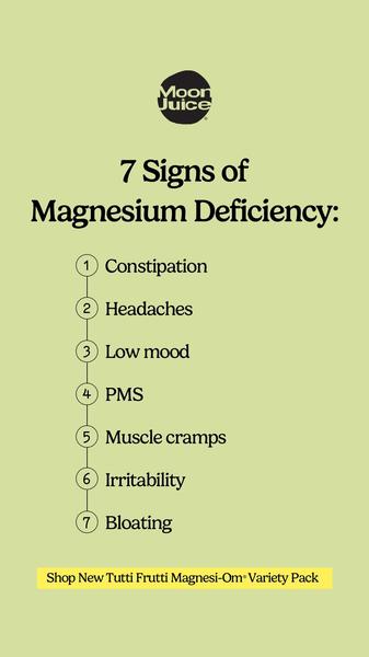
A clean, minimalist 9:16 vertical graphic using a listicle format to educate consumers on common symptoms of magnesium deficiency.
Free credits included. No card required
This Magnesium Supplement ad creative utilizes a classic problem-awareness listicle strategy that stops the scroll by addressing immediate, relatable pain points. By presenting seven distinct symptoms in a clean, vertical format, the design prioritizes readability and consumer education over aggressive hard selling, successfully establishing the brand as a helpful authority. Directly connecting specific symptoms to product necessity allows for a high-converting bridge between curiosity and purchase intent. This structured pattern works because it respects the user's need for quick, actionable information while they browse mobile platforms. For most ecommerce teams, adopting a clear, text-heavy listicle like this one from Promer AI provides a scalable template for testing different health benefits or product use cases without requiring heavy video production.
Great ads start from an idea, a feeling, or a structure, not a blank design.
Pro tip
To improve conversion rates, try testing a variation that replaces the seventh symptom with a direct CTA button that hints at the specific benefit of the product. This creates a logical flow from acknowledging a problem to offering an immediate, clickable solution.




















Promer helps you find the pattern, adapt it to your product, and create your own version in minutes.






