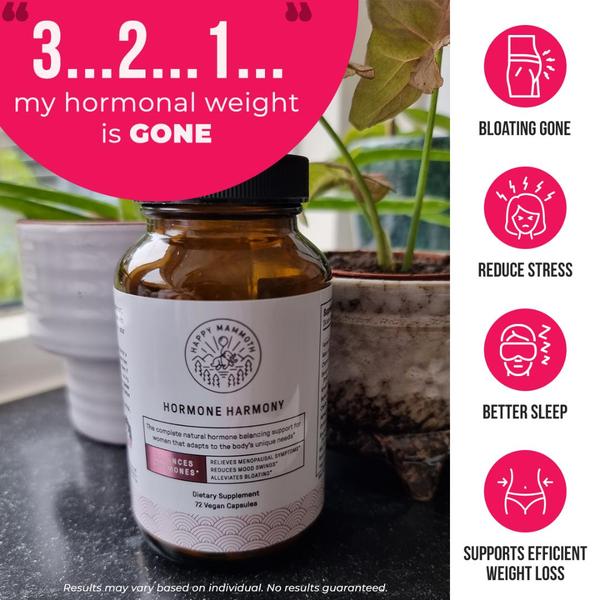
A square-format static ad showing a supplement bottle next to a plant, using a direct hook and benefit-driven icons to communicate value.
Free credits included. No card required
This Hormone Harmony ad creative utilizes a high-contrast visual hierarchy to immediately communicate product utility to the viewer. By combining an authentic, testimonial-style hook with clean, recognizable benefit icons, it manages to bypass the skepticism typical of supplement marketing through a direct, outcome-focused value proposition.
For most ecommerce teams, this approach works because it visually separates the emotional promise from the physical product, making it easier to scan on mobile. You can replicate this structural pattern in your own campaigns by using Promer AI to analyze high-performing layouts and apply similar visual hierarchies to your product catalog.
A winning creative should translate complex product benefits into instant visual cues that the customer can decode in under two seconds.
Pro tip
When using icon-based layouts like this one, ensure your iconography is consistent in stroke weight and style to maintain a professional look. Test different icon sets to see which specific benefit resonates most with your target demographic's current top-of-mind struggle.




















Promer helps you find the pattern, adapt it to your product, and create your own version in minutes.






