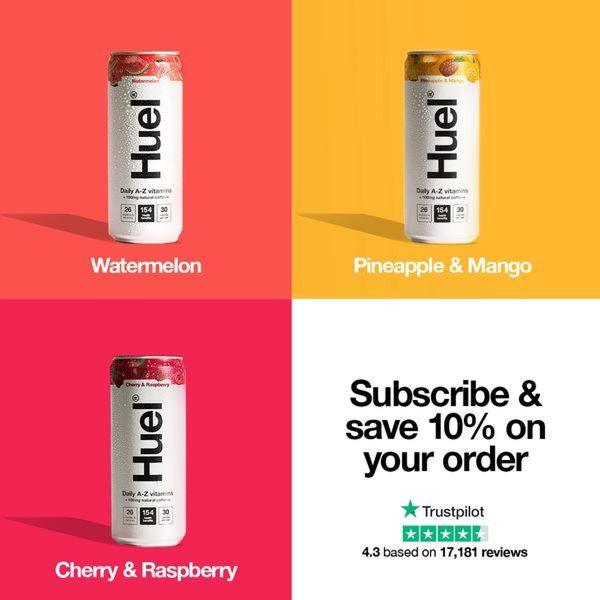
A clean, 1:1 grid layout presenting three flavored nutritional beverage cans with a clear call-to-action to subscribe and save.
Free credits included. No card required
This nutritional beverage creative leverages a clean, 1:1 quadrant grid to showcase multiple product flavors simultaneously without overwhelming the viewer. By anchoring the visual hierarchy on bright, solid background colors and high-contrast, professional product shots, the ad creates an organized and trustworthy aesthetic that commands immediate attention.
This structural approach effectively reduces friction in the buyer journey by surfacing both product variety and an incentive offer in a single frame. Using Promer AI, you can break down the modular design of this creative to understand how color-blocking influences visual recall for your own product catalog, typically improving click-through performance on social platforms.
Great ads are built on clear, intentional structures that organize your brand information into a single, high-converting visual experience.
Pro tip
When using a grid layout for multiple products, ensure the color palette of your background blocks matches the primary color of each specific product variant. This color-matching helps the human eye group information faster, typically increasing ad engagement compared to random background choices.




















Promer helps you find the pattern, adapt it to your product, and create your own version in minutes.






