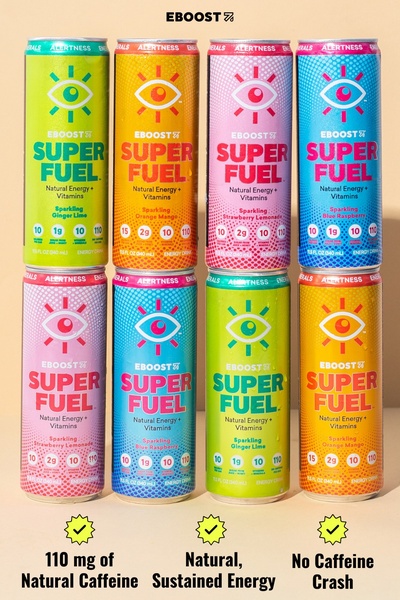
A high-contrast visual display of eight energy drink cans organized in a grid, accompanied by three core benefit statements at the bottom.
Free credits included. No card required
This energy drink creative succeeds by replacing long-form copy with an organized benefit grid. By pairing vibrant, high-contrast packaging with simple, bulleted value propositions, the ad removes cognitive load and allows the customer to immediately grasp the product's value in a single glance. The core of this layout is its visual symmetry, which positions the product as both premium and reliable.
This approach works for any Promer AI user looking to highlight multiple product variants or specific nutritional benefits without cluttering the screen. In most cases, simplifying your value communication into a clear grid format can help overcome consumer hesitation by making the product's primary strengths the most prominent element in the visual hierarchy.
A clean visual grid turns a standard product catalog into a high-performance value statement that stops the scroll.
Pro tip
When using a grid format, keep the background tone consistent so the product packaging remains the focal point. Use high-contrast text overlays to ensure your core benefits are legible even on mobile devices where the grid will be small.




















Promer helps you find the pattern, adapt it to your product, and create your own version in minutes.






