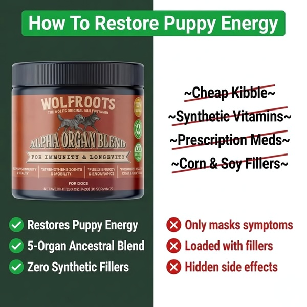
A square ad creative that uses a comparison table to contrast the brand's organ blend against inferior pet supplement market standards.
Free credits included. No card required
This Alpha Organ Blend ad creative employs a classic 'Us and Them' framing that visually separates the brand from low-quality industry alternatives. The core point is to leverage a binary comparison where one side is visibly disqualified by strike-through text, creating an immediate mental shortcut for the customer. By utilizing a split-screen design, the brand forces the viewer to choose between 'the old way' (fillers, synthetic ingredients) and their premium organic alternative.
For performance marketers, this structure is highly effective because it simplifies complex product benefits into an easy-to-digest checklist. You can replicate this exact logic inside Promer AI to swap the product subject while maintaining the same high-converting comparison layout. This approach typically succeeds when the contrast is sharp and the benefits are directly mapped to the customer's primary pain points.
A powerful ad doesn't just sell your product; it defines the standard by which all other products in your category are judged.
Pro tip
When using this comparison format, focus your negative column on categories that your target audience already fears or dislikes. By framing the 'competitor' column with common industry complaints, you position your product as the natural, high-trust solution for the same problem.




















Promer helps you find the pattern, adapt it to your product, and create your own version in minutes.






