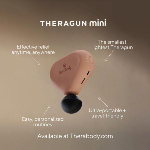
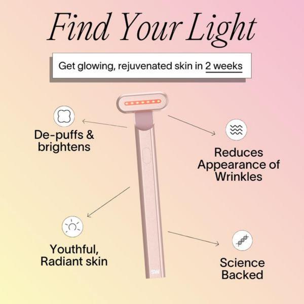
A high-contrast, minimalist studio shot of a Theragun Mini using clear lines and text overlays to communicate four distinct product benefits.
Free credits included. No card required
This Theragun Mini ad creative employs a minimalist visual strategy that prioritizes immediate comprehension through spatial organization. By anchoring the product in the center and radiating key benefits outward with clean callout lines, the ad successfully removes cognitive friction for the viewer. This structure ensures the most vital selling points are consumed instantly, preventing the user from needing to hunt for value propositions amidst a busy design.
For most ecommerce teams, this pattern serves as a high-performing baseline for feature-focused campaigns. Platforms like Promer AI allow you to replicate this clean, infographic-style framing for your own products, ensuring your core features remain the hero of the image. When testing this approach, always verify that your callout text directly answers the primary pain point your product solves, rather than simply listing secondary technical specifications.
The most effective ads don't force the user to work; they map out the product's value in a single, instinctive glance.
Pro tip
When using this infographic-style layout, test different background tones that create high contrast with your product to ensure the text remains legible. Keep your total word count per callout under five words to maintain the minimalist aesthetic that makes this specific design so effective.










Promer helps you find the pattern, adapt it to your product, and create your own version in minutes.






