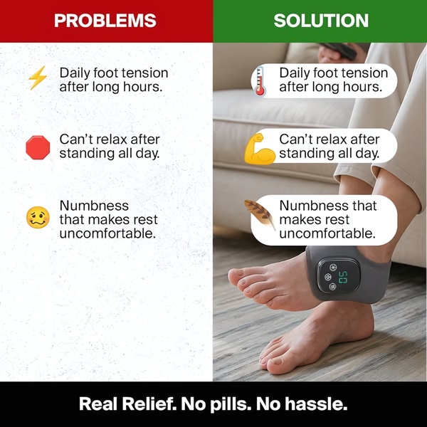
A split-screen ad format showcasing a common physical pain point on the left and the product solution on the right to demonstrate immediate relief.
Free credits included. No card required
This Foot Massager ad creative utilizes a classic split-screen visual structure to contrast the user's current frustration with the benefits of the product. By juxtaposing pain points against a clear solution, the ad minimizes cognitive load and forces the viewer to identify their own discomfort immediately. The core effectiveness lies in the immediate psychological payoff provided by the right side of the screen, which validates the pain recognized on the left.
For most ecommerce teams, this clean, high-contrast framing is a repeatable pattern that simplifies value propositions. Using Promer AI allows you to rapidly build and iterate on this layout for your own catalog, ensuring the visual contrast remains sharp and effective. Maintaining a clear visual separation between the problem and the benefit is a foundational tactic for static ads targeting specific physical relief products.
A high-converting ad does not just show the product; it demonstrates the exact transformation from the state of pain to the state of relief.
Pro tip
When creating split-screen layouts, ensure the 'Solution' side features real photography of the product in action, as shown in the example. This bridges the gap between abstract relief and the actual physical product, which is vital for building trust in the solution.








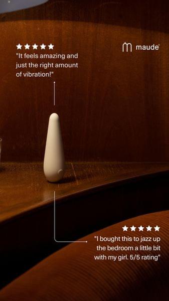


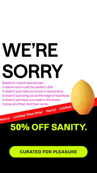

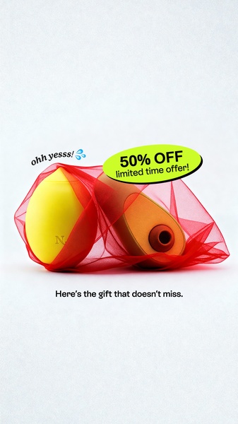



Promer helps you find the pattern, adapt it to your product, and create your own version in minutes.






