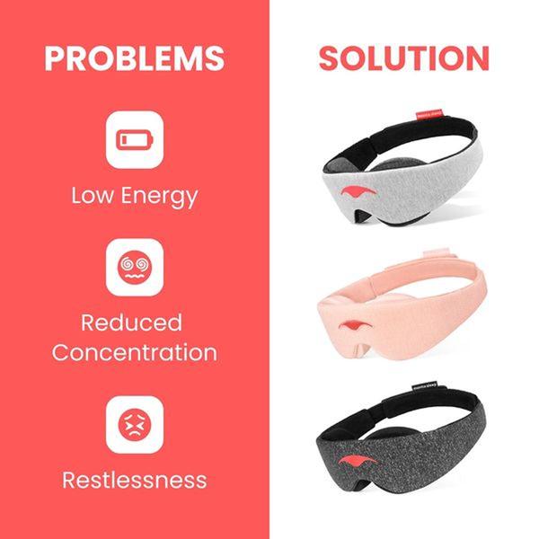
A split-screen creative that clearly contrasts common user pain points like low energy with the immediate relief provided by the sleep mask.
Free credits included. No card required
This sleep mask ad creative utilizes a classic split-screen layout to instantly bridge the gap between user frustration and product relief. By pairing relatable icons of low energy and reduced concentration with a clean, high-quality image of the product, the viewer grasps the value proposition in under a second. This clear binary framing reduces cognitive load for the viewer, ensuring the primary benefit is communicated through direct visual association rather than dense text.
Adopting this structure allows teams using Promer AI to standardize their messaging across multiple product variations or colorways. Because the layout isolates the problem on one side and the solution on the other, it is highly adaptable for A/B testing different pain points—such as travel fatigue or office burnout—while keeping the core branding and call-to-action consistent.
Great ads start from a clear structure that translates a user pain point into a tangible product benefit.
Pro tip
When testing this layout, rotate the pain point icons to match different user segments—such as busy parents, travelers, or students. This keeps the creative fresh while maintaining the proven problem-solution structure that drives high click-through rates.
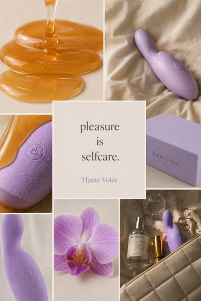
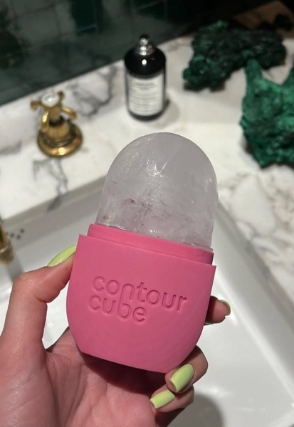
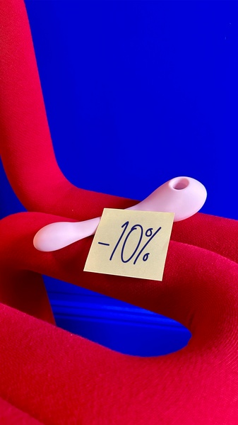


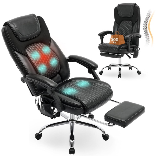

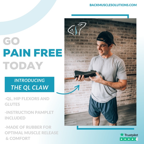
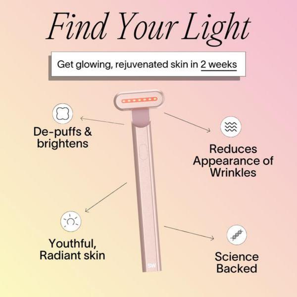

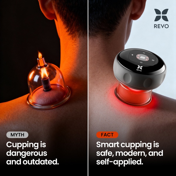
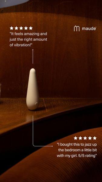


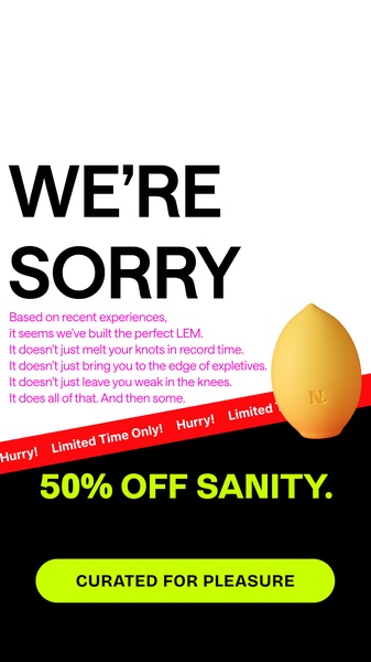

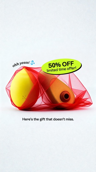
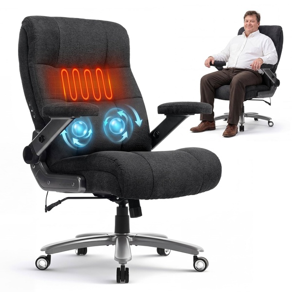

Promer helps you find the pattern, adapt it to your product, and create your own version in minutes.






