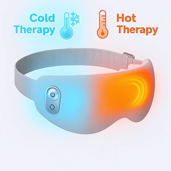
A clean, minimalist product shot of a heated eye massager that uses color-coded zones to clearly communicate the dual cold and hot therapy features.
Free credits included. No card required
This heated eye massager ad creative uses a high-contrast, split-screen approach to immediately communicate product utility without requiring the viewer to read heavy copy. By mapping the cold-blue aesthetic to the power button and the orange-warmth aesthetic to the massage zone, the visual language instantly bridges the gap between feature and benefit.
This pattern works because it respects the viewer's cognitive load during fast-paced scrolling, a core strategy favored by performance teams using Promer AI to test visual hierarchies. For most health-focused product ads, clearly delineating what an item does through iconography—like the thermometer icons used here—typically results in higher engagement compared to lifestyle imagery alone.
A truly winning ad communicates the core value proposition through visual shorthand before the customer ever reads the headline.
Pro tip
When using a split-screen or color-coding strategy, ensure your icon placement aligns exactly with the physical button or feature on your product. This builds trust by verifying the physical reality of the product while demonstrating technical precision.







Promer helps you find the pattern, adapt it to your product, and create your own version in minutes.






