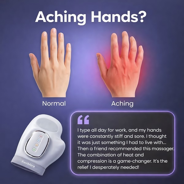
A split-screen comparison showing a hand in pain versus a normal hand, paired with a testimonial and the featured hand massager.
Free credits included. No card required
This hand massager ad creative relies on a clear, visual-first hook that contrasts physical pain with desired health outcomes. By utilizing a split-screen layout, the ad immediately identifies the viewer's potential pain point—aching hands—before presenting the product as an accessible, tangible resolution. This approach of using a 'Before vs After' visual anchors the viewer's experience in reality, creating instant rapport.
For most ecommerce teams, this pattern proves effective because it removes ambiguity about what the product does. You can replicate this structural clarity using Promer AI to ensure your product is positioned similarly within a high-converting testimonial framework.
Great ads start from a structured conflict between a user's current pain and your product's relief, not just a clean design.
Pro tip
When testing comparison ads, ensure the 'pain' side of the image isn't too aggressive or off-putting. The goal is to build empathy with the user's struggle, not create a negative association with your brand.










Promer helps you find the pattern, adapt it to your product, and create your own version in minutes.






