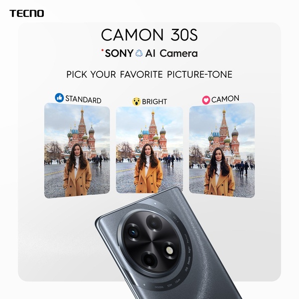
A high-contrast comparison graphic demonstrating three distinct photo processing modes available on the device.
Free credits included. No card required
This creative works by leveraging a clear, interactive choice hook to frame the smartphone camera as a versatile tool for the user. By inviting viewers to engage with three distinct color profiles—Standard, Bright, and Camon—the brand shifts the focus from passive observation to active participation. Presenting tangible feature outcomes in a split-screen layout establishes immediate product utility and credibility with the viewer.
For most ecommerce brands, this strategy functions well because it simplifies complex technical specifications into a relatable consumer preference. Using Promer AI allows you to replicate this structured comparison for your own product range, ensuring your specific benefits are highlighted with the same professional, clean aesthetic seen here.
Great ads are built on a structure that respects the user's intelligence by offering a clear, visual choice rather than just listing features.
Pro tip
When creating a comparison-style graphic, ensure your images maintain a consistent frame and subject matter to make the differences in filters or modes the only variable. This clarity prevents consumer fatigue and focuses the eye on your unique product performance.
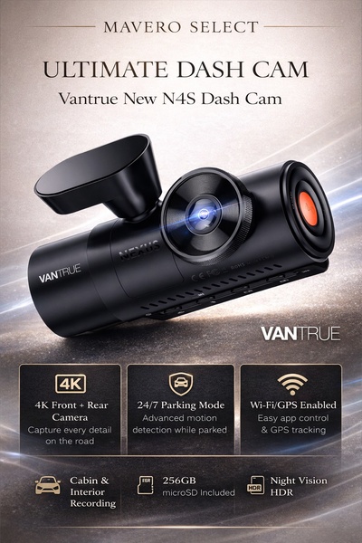
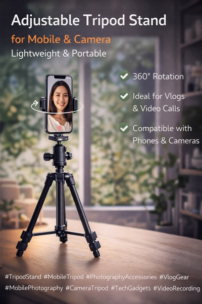
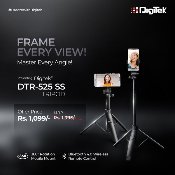
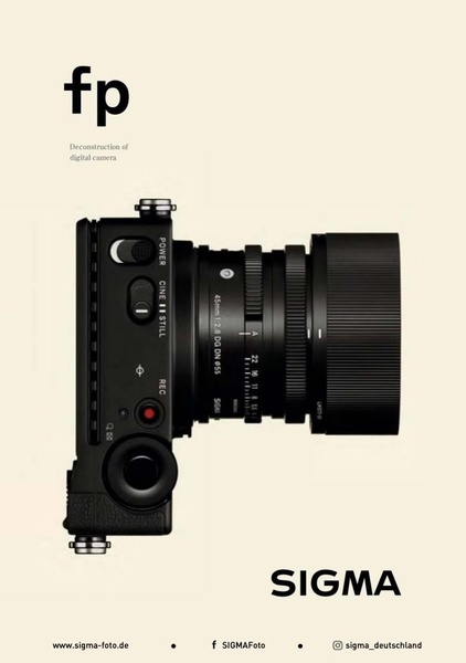
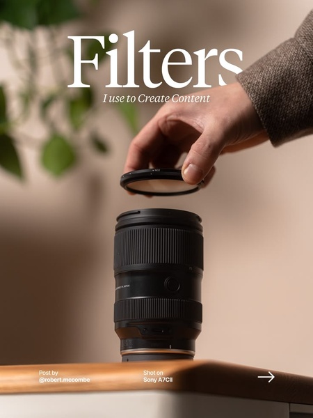


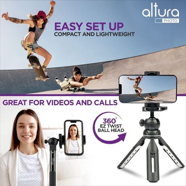
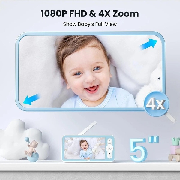
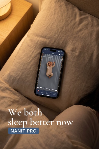

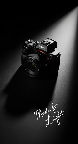

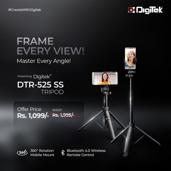
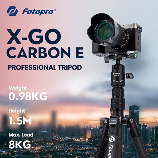

Promer helps you find the pattern, adapt it to your product, and create your own version in minutes.