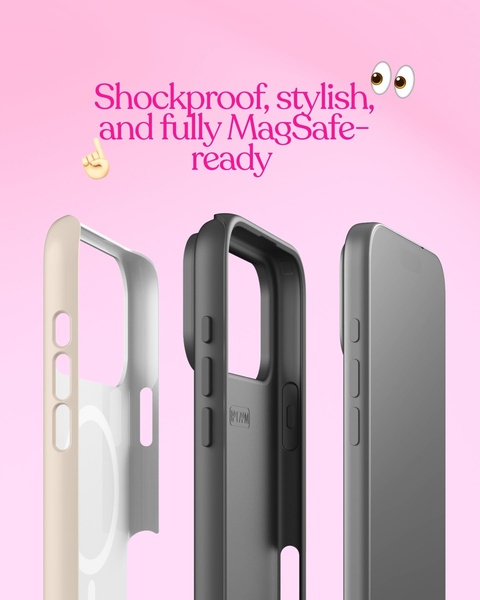
A clean, high-contrast display of three phone case models in varying colors to communicate durability and design compatibility.
Free credits included. No card required
This phone case advertisement utilizes a clean, high-contrast visual hook to communicate product quality through an uncluttered layout. By presenting three distinct color variations in a single frame, the brand creates a cohesive story that emphasizes both aesthetic appeal and physical protection without distracting clutter. The creative works because it establishes immediate product trust by using a consistent, professional studio aesthetic that appeals to style-conscious shoppers.
For most ecommerce teams, this structure is highly effective for testing new colorways or highlighting key product features like MagSafe compatibility. You can easily replicate this high-conversion layout using Promer AI to ensure your brand's unique assets are integrated while maintaining the same professional, minimalist composition that drives engagement in your specific market category.
Effective product visuals lean on a clear hierarchy that guides the customer's eyes from the primary benefit to the product form.
Pro tip
When using a trio layout, ensure the lighting and angle are consistent across all items to maintain a premium feel. If your phone case has specific functional details, place one item slightly offset to draw focus to those unique textures.


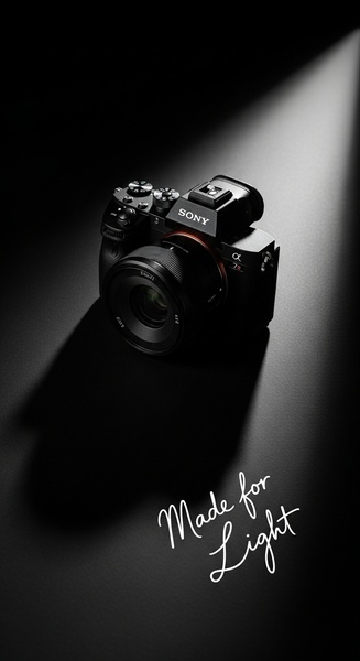
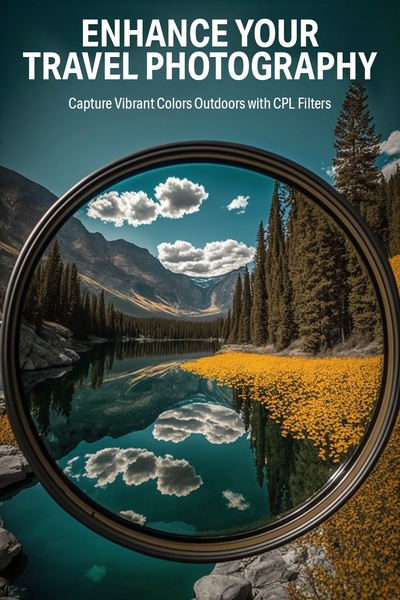
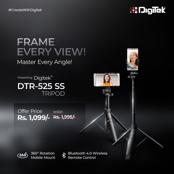
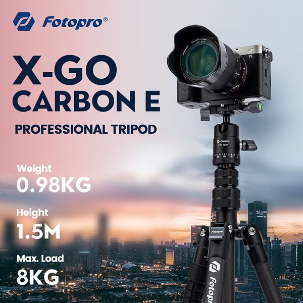

Promer helps you find the pattern, adapt it to your product, and create your own version in minutes.