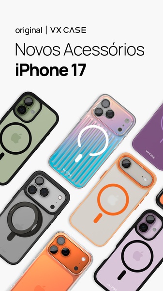
A high-end visual product grid showcasing various iPhone 17 protective cases in different colors, textures, and magnetic ring configurations.
Free credits included. No card required
This ad works by prioritizing a clean, expansive product grid that lets the viewer instantly recognize the variety of styles available for their phone case needs. By leveraging a high-key, bright background and uniform spacing, the creative minimizes visual clutter and centers the focus entirely on the product design and color options. The primary strength of this strategy is how it facilitates rapid product identification, allowing potential customers to scan multiple SKUs in a single glance without feeling overwhelmed.
For most ecommerce teams, this structure is highly effective when launching a new collection or seasonal update. By using Promer AI to maintain consistent lighting and color fidelity across your own product shots, you can achieve this professional catalog look without needing a full-scale studio production. This approach works well for items where color variety and hardware compatibility are the primary drivers of purchase intent.
A perfectly aligned product grid does the heavy lifting by visually demonstrating your range before the user even reads your headline.
Pro tip
When building a product grid, always ensure your highest-margin items are placed in the center or the upper-left corner of the creative. This guides the user's eye naturally toward the products you most want to move, even in a diverse assortment shot.

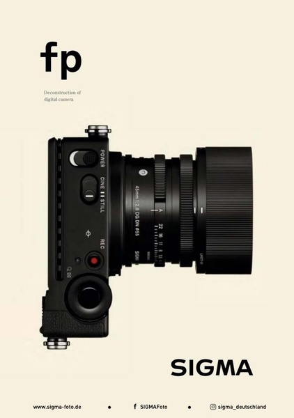
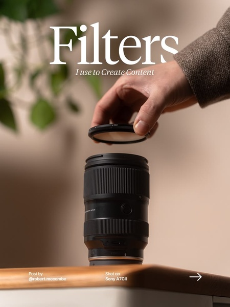


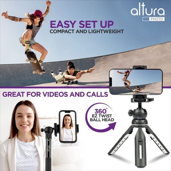
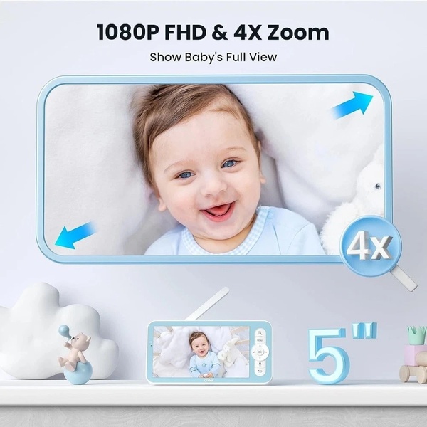




Promer helps you find the pattern, adapt it to your product, and create your own version in minutes.