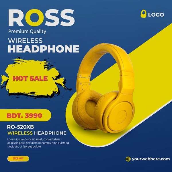
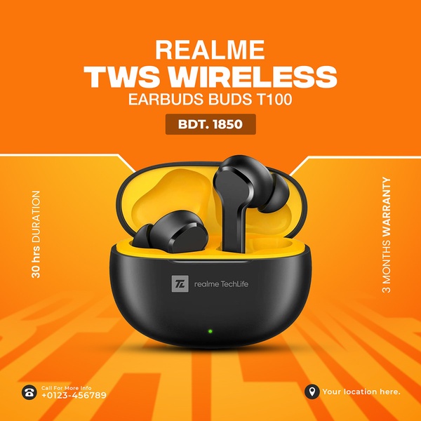
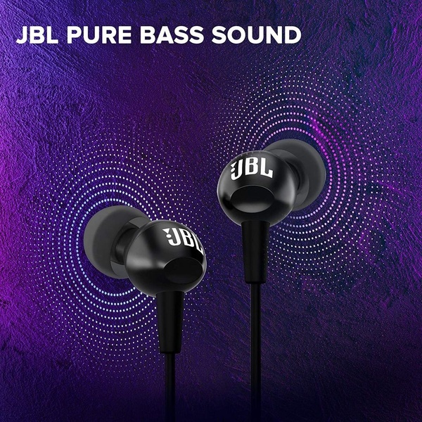
This static square graphic uses strong color contrast and a bold product cutout to highlight a wireless headphone sale.
Free credits included. No card required
This graphic leverages a high-contrast color palette to spotlight the wireless headphone as the center of attention. By combining deep blue with vibrant yellow, the visual hierarchy immediately draws the eye toward the product and the offer, making the core promotional message unmistakable even at a quick scroll speed.
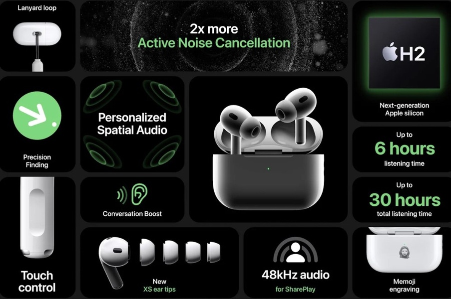
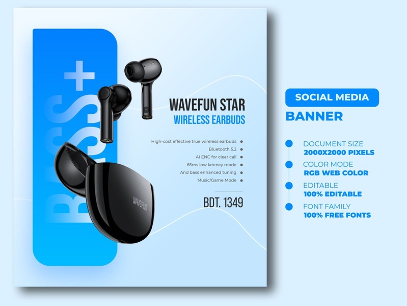
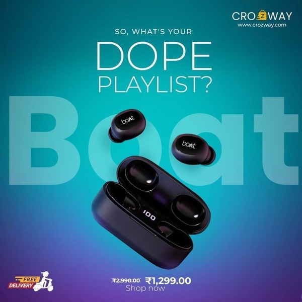
For most brands, this structured approach works because it removes visual noise and focuses entirely on product features and pricing. Using Promer AI to standardize these elements helps ecommerce teams maintain consistency across varied product lines while ensuring that high-intent offer blocks remain the primary focus for potential customers.
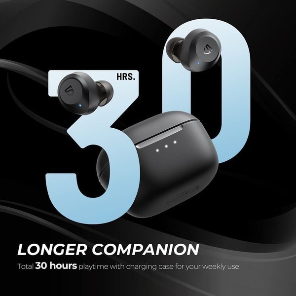
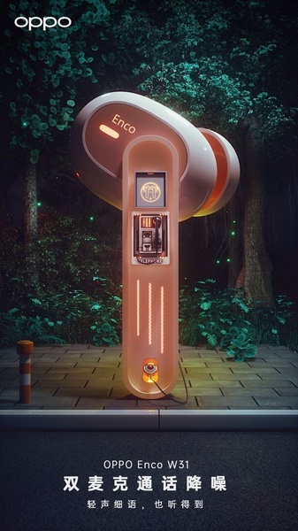
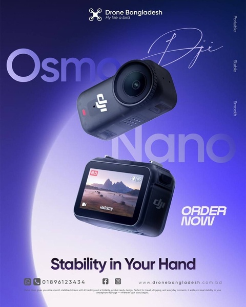
Great ads are built on clear visual priorities that make the product the hero of the sale.
Pro tip
When using high-contrast color blocks, ensure your brand logo has enough negative space around it so it doesn't get lost in the background. Use the dominant color from your product as the main accent color for your text overlays to maintain visual harmony.


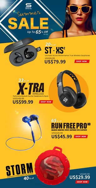
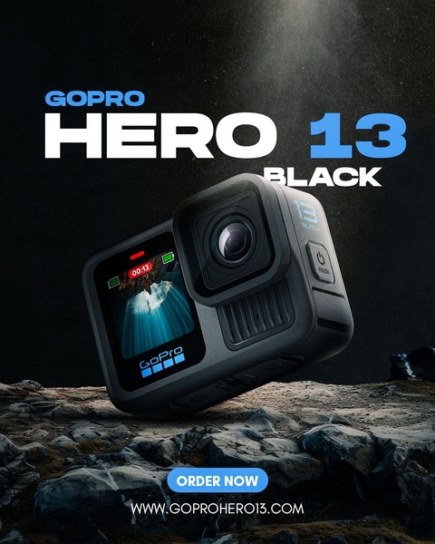



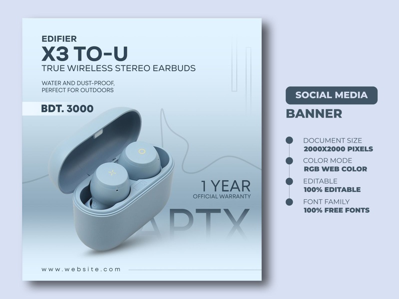




Promer helps you find the pattern, adapt it to your product, and create your own version in minutes.






