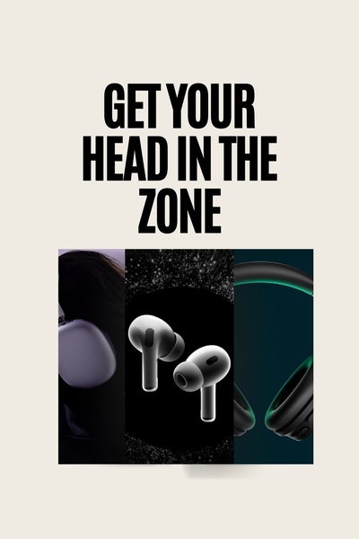
A clean, high-contrast, three-panel creative showcasing different headphone styles with bold, direct typography.
Free credits included. No card required
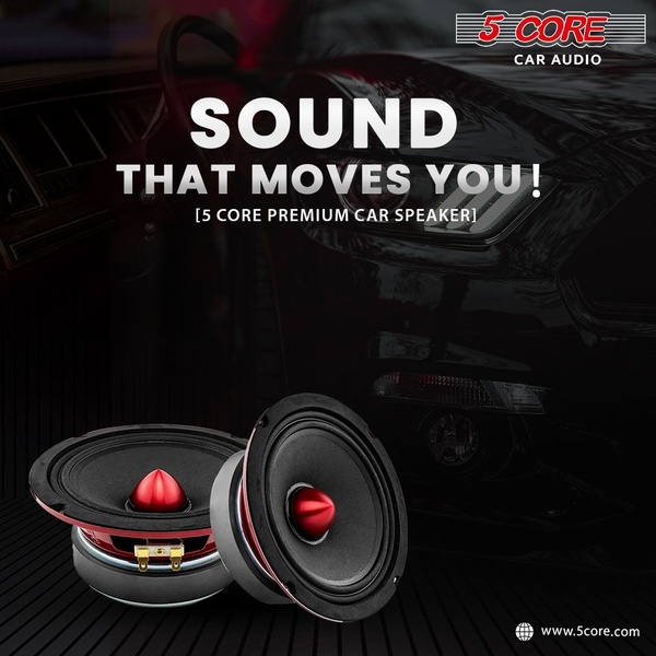
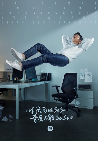
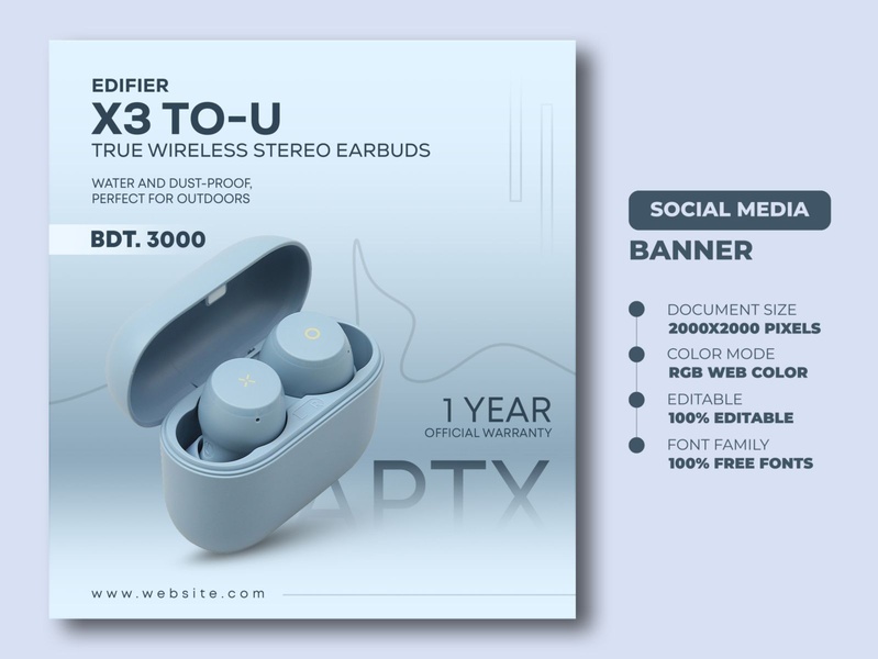
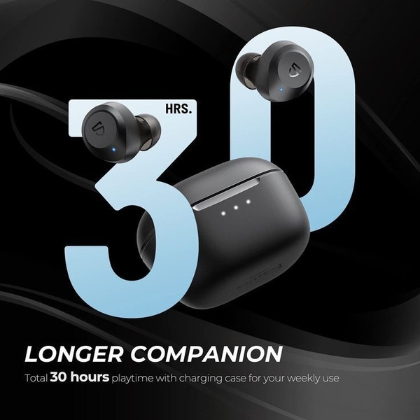
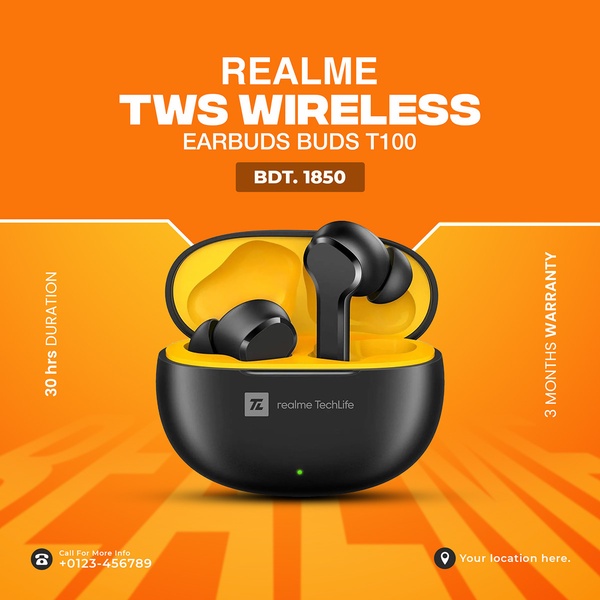
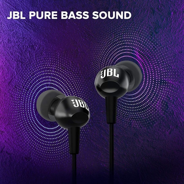
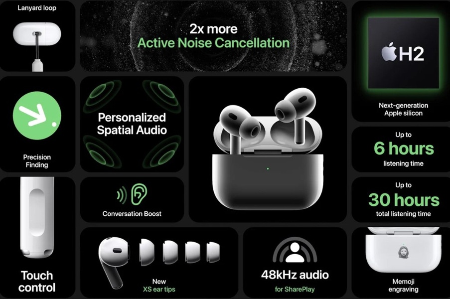
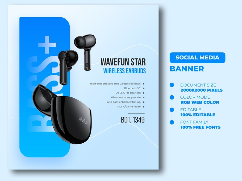
This approach uses a high-contrast, minimalist layout to position headphones as the ultimate tool for deep focus. The creative strategy relies on the tension between bold, direct typography and clean product imagery to stop the scroll immediately. By presenting multiple variations within a single frame, the brand provides the viewer with immediate choice, appealing to different customer preferences without cluttering the screen.
For most ecommerce teams, this modular layout effectively communicates product versatility through Promer AI, which can help replicate this clean aesthetic for your own catalog. The design works because it avoids the fatigue caused by busy, sales-heavy imagery, instead choosing to prioritize the sleekness of the device. This style is particularly effective for premium electronics where the visual weight of the hardware is the primary selling point.
A powerful ad structure should strip away the noise so your product can own the viewer's entire attention.
Pro tip
When using a direct benefit headline, ensure it matches the exact pain point your specific audience is facing in their daily flow. Use the space below the text to highlight a unique feature that directly solves that problem, maintaining the minimalist aesthetic.




Promer helps you find the pattern, adapt it to your product, and create your own version in minutes.






