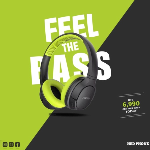
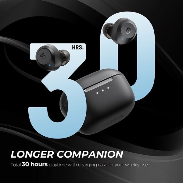
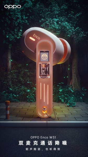
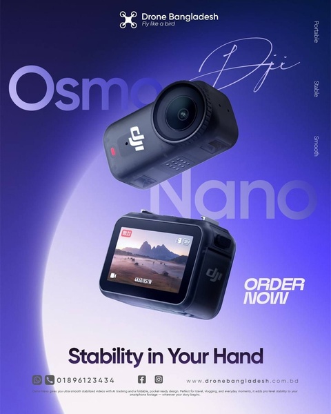
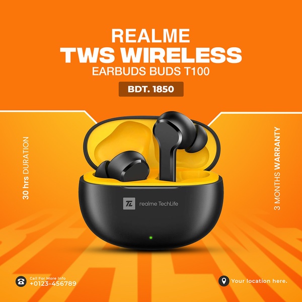
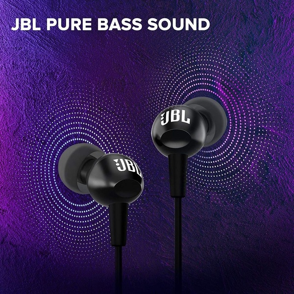
A high-contrast 1:1 square graphic for headphones, focusing on a clear call-to-action and bold product-centric messaging.
Free credits included. No card required
This creative utilizes a high-contrast split-screen layout to draw immediate attention to the headphones while prioritizing the core benefit of the product. By combining the vibrant lime green background with bold, sans-serif typography, the design creates a clear visual hierarchy that ensures the 'Feel The Bass' message is the first thing a user sees.
The effectiveness of this pattern lies in its brutal simplicity and focused, singular call-to-action which reduces cognitive load for the viewer. For most brands, using a platform like Promer AI to standardize these high-converting structural elements—like color-blocked backgrounds and benefit-first headlines—allows teams to quickly iterate on seasonal offers without needing complex creative assets.
Great ads start from a clear structure that translates a product benefit into an instant emotional hook.
Pro tip
When using high-contrast color blocks, ensure your product imagery is isolated or has a transparent background to maintain the clean, graphic look. Test a variation where the product color matches or complements the background to see if a more unified aesthetic increases click-through rates.


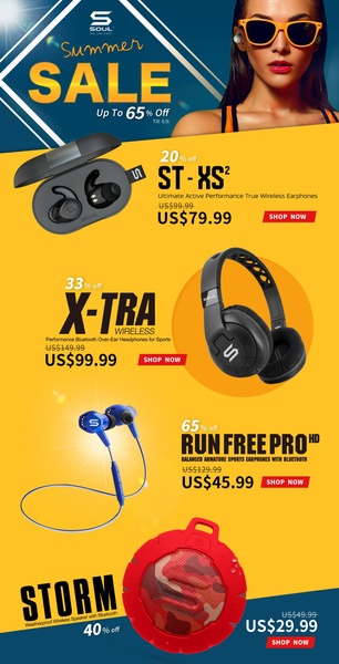
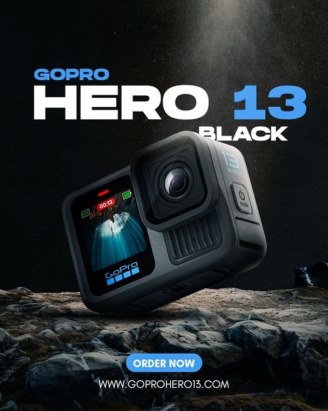



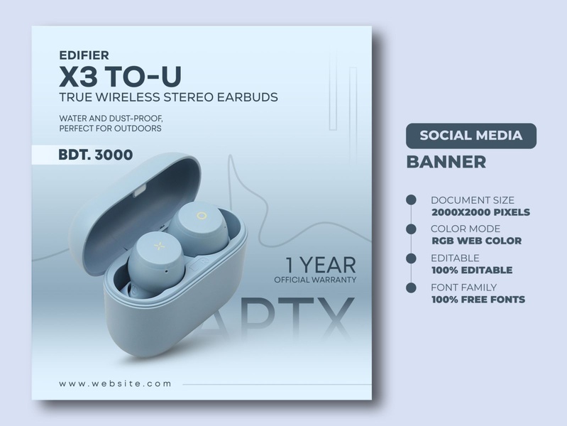




Promer helps you find the pattern, adapt it to your product, and create your own version in minutes.






