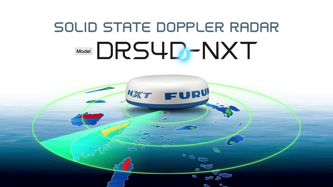
A clear, clean 16:9 visualization of a solid state doppler radar unit scanning a maritime environment with radar wave rings.
Free credits included. No card required
This Doppler radar visual strategy leverages a clean, high-contrast diagram to immediately communicate core product utility without distracting clutter. By isolating the doppler radar unit atop an intuitive circular wave display, the brand focuses the viewer's attention on the hardware's range and detection capabilities.
This approach works because it transforms complex technical specs into a simple, recognizable visual language that performance-minded buyers instantly grasp. You can replicate this structural clarity with Promer AI to ensure your product hero shot communicates function before the user even reads the headline.
Effective product imagery should act as a functional diagram, not just a static photograph.
Pro tip
When using technical diagrams in your ads, ensure your wave patterns or data rings reflect actual product performance metrics. This builds credibility with technical buyers who look for evidence of capability rather than just marketing fluff.



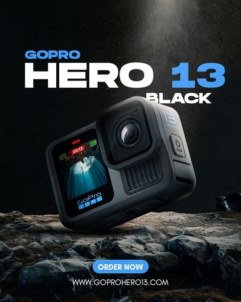



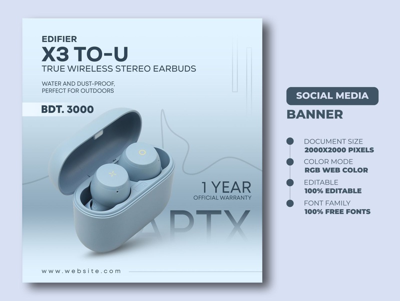




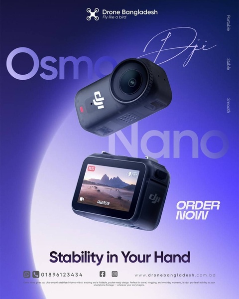



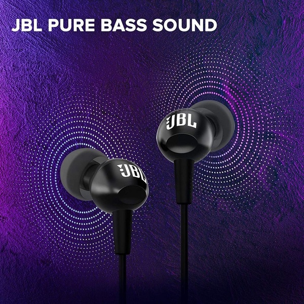
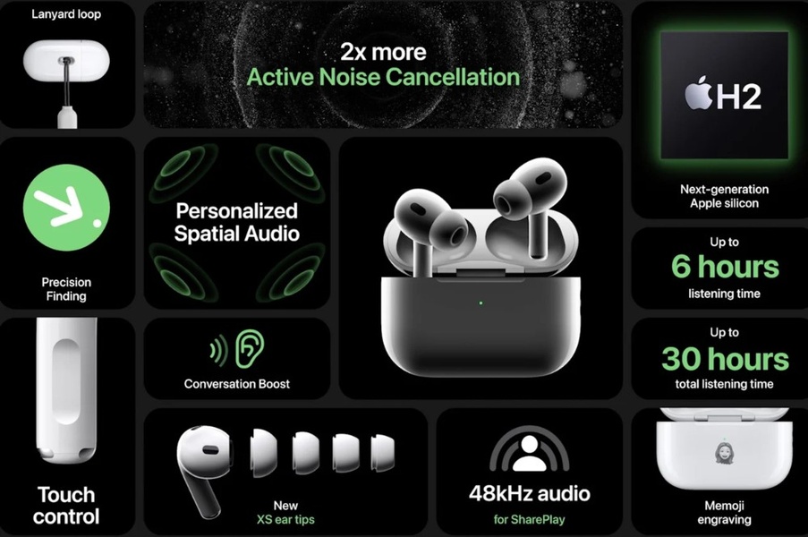
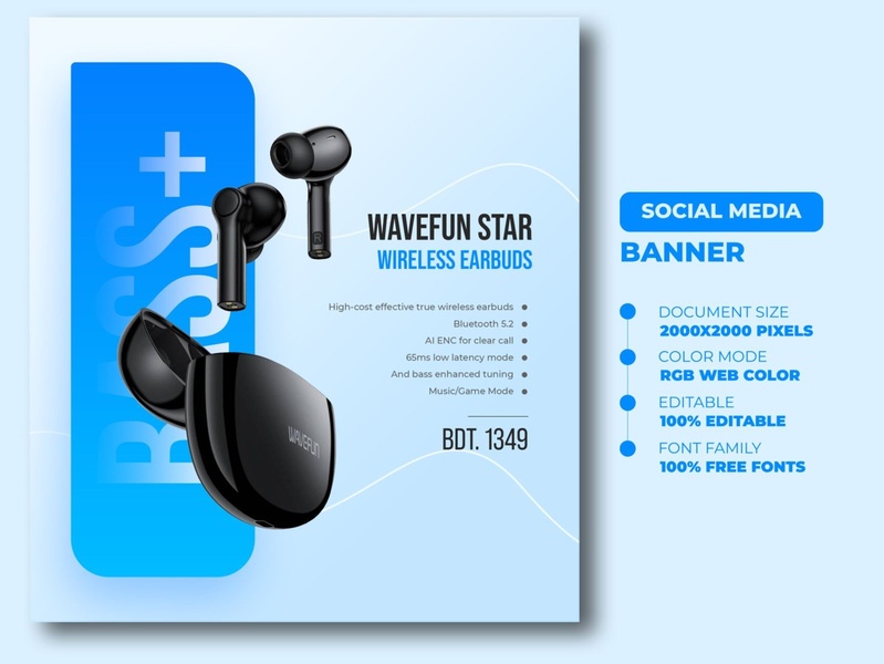

Promer helps you find the pattern, adapt it to your product, and create your own version in minutes.






