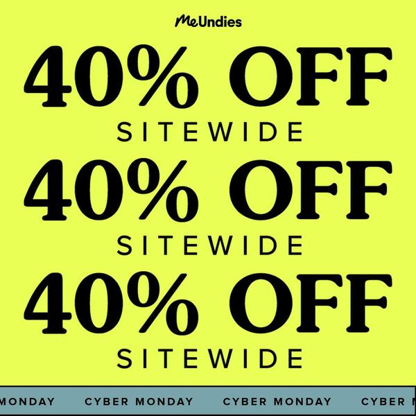
This static creative uses a high-visibility neon yellow background with repeated, bold typography to communicate a sitewide discount for an underwear brand.
Free credits included. No card required
This underwear ad relies on extreme color contrast and repetitive visual hierarchy to dominate a busy social media feed. The repetition of the offer anchors the viewer’s attention instantly, making the 40% discount impossible to scroll past without processing the core value proposition of the sale.
For most ecommerce teams, stripping away complex imagery in favor of a bold color palette is an effective way to cut through creative fatigue. By leveraging tools within Promer AI, you can test these high-contrast layouts for your own product lines to determine which color combinations yield the highest click-through rates.
Great ads are built on clear, high-impact structures that prioritize the message over unnecessary visual clutter.
Pro tip
When using high-contrast colors like neon yellow, always ensure your typography remains accessible by using a heavy, sans-serif font weight. This combination keeps the ad readable while maintaining the aggressive visual punch required for short-term promotional events.






Promer helps you find the pattern, adapt it to your product, and create your own version in minutes.






