



What Makes a Cyber Monday Ad Template Work in a Crowded Feed?
A Cyber Monday ad template works when the deal can be read in about a second: one big number, one clear event cue, and a background loud enough to stop the scroll. Everyone in the feed is running a sale that day, so the creative that wins attention is usually the one that says the offer fastest.
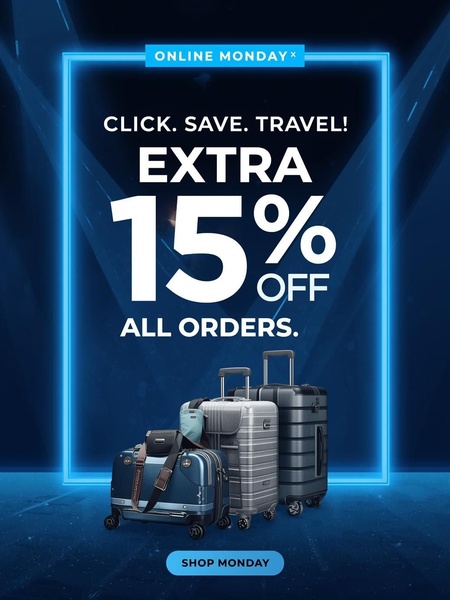
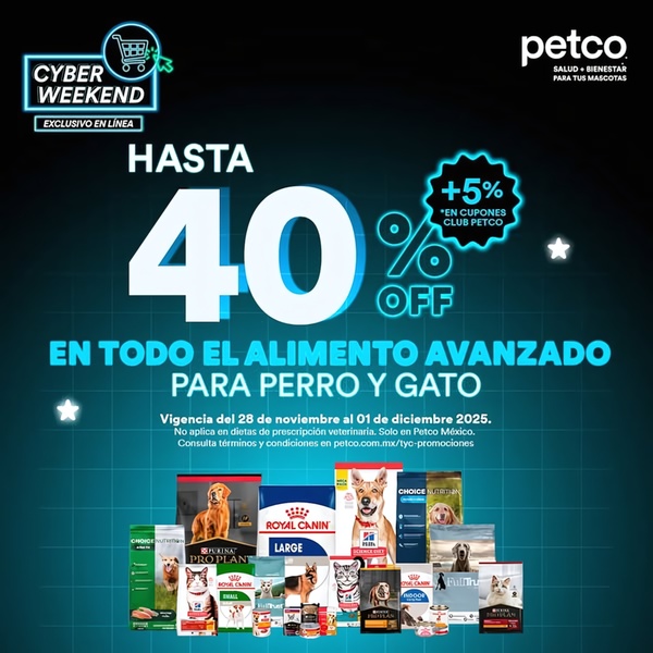
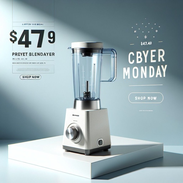
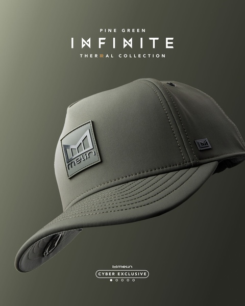
The ads in this library lean on the same few moves. A discount like 50%, 70% or 80% takes the largest type on the image. A high-contrast palette - red and white, black and neon, navy and cyan, or yellow with blue - makes the number readable on a phone. The product sits in the middle on a pedestal, in a torn-paper reveal or inside a starburst, with nothing else competing for space.
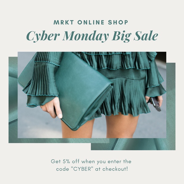
Urgency comes from the copy and the format. A "24-hour online sale" line, a promo code printed on the image, a "Get Yours Now" button and an early-access headline all give the viewer a reason to click today instead of later. Some ads skip the product altogether and let the offer carry the whole frame, while price-led apparel ads keep the product big and make the price the anchor.
Top Creative Cyber Monday Ads to Learn From
Here are 10 Cyber Monday advertising examples from the library, from text-led discount graphics to product-led electronics and apparel layouts. Each one shows what the ad does and what you can borrow.
Example 1: 80% Off Activewear Flash Sale (Offer & Sale, 1:1)
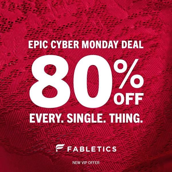
The frame is a deep red background with oversized white type in the center, and the 80% discount sits at the optical middle. There is no product photo, so the offer is the only thing a viewer can read.
Borrow: when the discount itself is the story, give it the whole image - two colors, one number and a single call to action.
Example 2: Smartphone Torn-Paper "Surprise" Offer (Offer & Sale, 1:1)
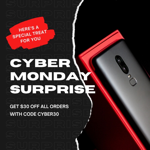
A vertical tear splits the black background and reveals a smartphone, with red accents and a Cyber Monday surprise headline. The $30 discount sits directly under the headline, so the saving is read before the product details.
Borrow: a reveal effect makes a plain discount feel like a surprise - keep the amount placed right under the headline.
Example 3: Game Controller With a 50% Starburst (Offer & Sale, 1:1)
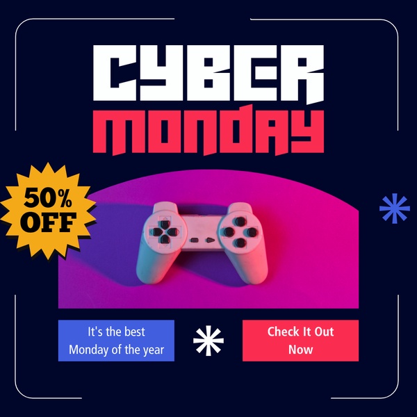
A game controller sits in the center of a navy, neon pink and neon purple background. A bold yellow starburst carries the 50% off callout, so the badge is the brightest thing on the image.
Borrow: one saturated accent color, used only on the discount badge, so the eye lands on the offer first.
Example 4: Smartwatch With a Holographic Badge (Offer & Sale, 1:1)
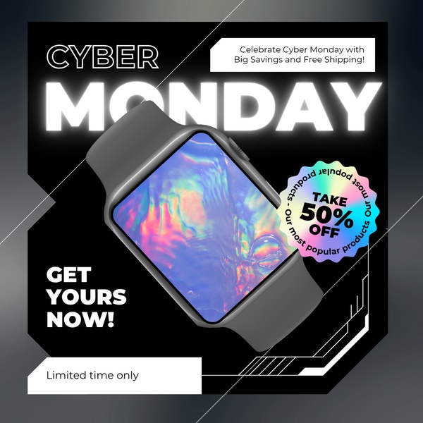
A smartwatch is shot on a deep black background with white text and a holographic gradient on the 50% off badge. A "Get Yours Now" call to action closes the layout, so the next step is clear.
Borrow: a textured or gradient badge on a plain dark background, with a short button line beneath it.
Example 5: Neon Cyber Monday Gadget Sale (Offer & Sale, 1:1)
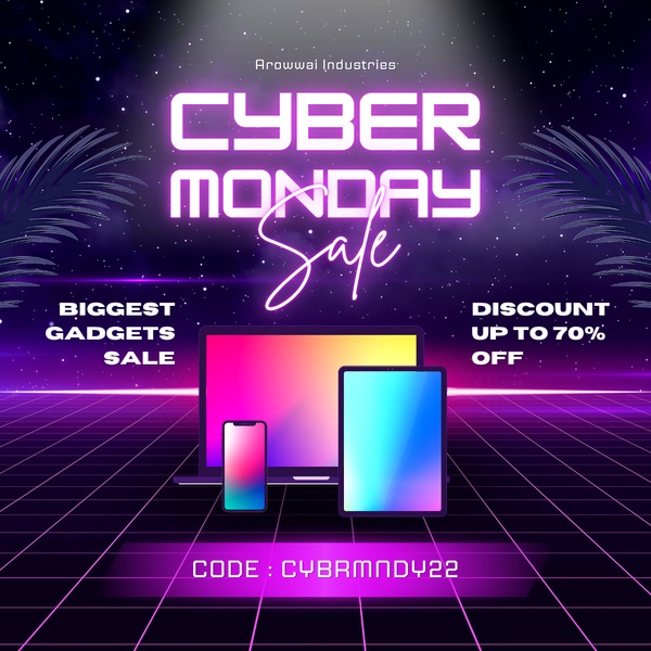
A range of gadgets is placed in front of a neon grid in purple, pink and cyan on black. The headline pairs the Cyber Monday name with a 70% off claim, and the product images stay centered so the sale reads as a tech event.
Borrow: let the background match the product category, but keep the grid subtle enough that the products stay the hero.
Example 6: Keyboard "24-Hour Online Sale" With a Promo Code (Offer & Sale, 16:9)

A keyboard glows with neon blue accents on a black wide banner, with a digital glitch feel. The copy says "24-hour online sale" and "Mega Deals," and the promo code MEGAMONDAY is printed on the image.
Borrow: print the time limit and the code on the creative, so the viewer has everything needed to buy without reading the landing page first.
Example 7: Electronics Bundle on a Yellow Pedestal (Offer & Sale, 9:16)
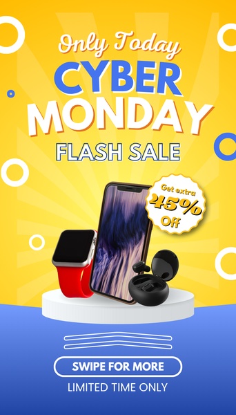
A smartphone, a smartwatch and earbuds stand together on a clean white pedestal against a yellow radial background, with blue text. A circular badge names the extra discount, and the vertical format fills a Stories or TikTok screen.
Borrow: group several items as one bundle on a single pedestal, and keep the badge inside the safe zone so interface buttons do not cover it.
Example 8: Headphones on Pedestals (Offer & Sale, 1:1)

Several pairs of headphones are staged on elevated white pedestals against a dark blue background. Cyan text on blue names the Cyber Monday event, with a short line under it that adds pressure to act.
Borrow: pedestal staging for a sitewide sale, so one image can show several products and still look premium.
Example 9: Women's Clothing Collage "Mega Sale" (Offer & Sale, 1:1)
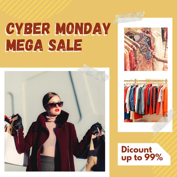
The square is split between a stylish model shot and a grid of apparel, on mustard yellow, white and dark red. Bold sans-serif type names the event and the discount, so the viewer gets both the look and the catalog in one frame.
Borrow: a collage for fashion - lead with your most representative piece in the model shot, then let the grid show range.
Example 10: Golf Trousers, Price-Led (Offer & Sale, 1:1)
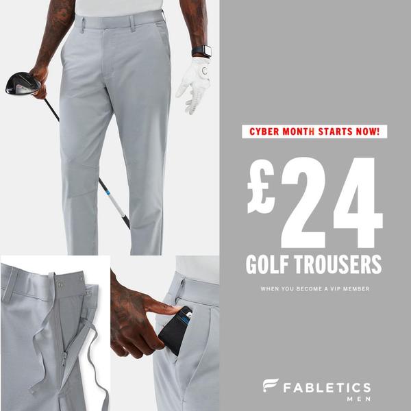
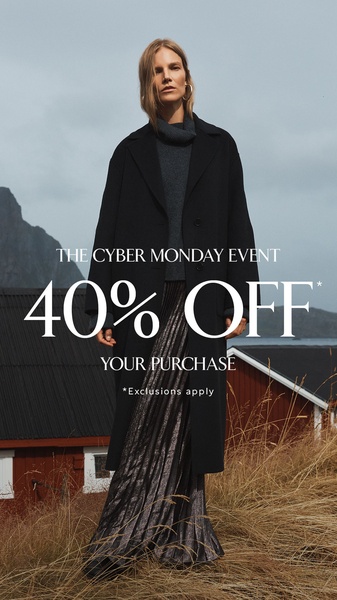
A clean hero shot of golf trousers is paired with a close-up detail view on a grey and white layout. A large, bold price is the anchor, and white space keeps the frame calm for a seasonal sale.
Borrow: show the actual price instead of a percentage, and add one detail shot - fabric, pocket or button - as proof behind it.
Cyber Monday Advertisement Ideas to Borrow From These Examples
- Give the number the biggest type - 50%, 70% or 80% should be readable from arm's length (Examples 1, 3, 4 and 5).
- Use a high-contrast pair - red and white, black and neon, or navy and cyan make the offer stand out (Examples 1, 5 and 8).
- Add a reveal or badge - a torn edge, a starburst or a holographic circle draws the eye to the deal (Examples 2, 3 and 4).
- Print the code and the clock - a promo code and a "24-hour" line remove the guesswork (Example 6).
- Build a bundle on one pedestal - several items under one offer, in a vertical format for Stories (Examples 7 and 8).
- Pair a lifestyle shot with a grid - emotion on one side, range on the other (Example 9).
- Lead with the price when the product is the proof - a clean hero plus a detail view (Example 10).
How Does Promer AI Turn Your Product Into a Cyber Monday Ad?
Most stores searching for a Cyber Monday ad maker already have the products and the discount. What is missing is the layout, the headline and the sizes for each placement. Promer AI works from your product page, so you start with the thing you sell rather than a blank canvas, and you can create your first ad free, no credit card required.
AI Ad Clone is the closest match to this page. Pick a reference from the library - the torn-paper reveal, the starburst badge or the pedestal bundle - and Promer AI rebuilds its structure around your product, with a headline, body and CTA suggested and each one editable. Your logo, colors and fonts come in through your Brand Kit.
If you want to find the angle first, AI Ad Concept reads your product page and returns product highlights, ideal customer, pain point and need, then builds concepts from them. AI Ad Prompt lets you describe the sale yourself, and AI Photoshoot turns the photos you already have into studio-quality images for the hero shot.
Ratios cover 1:1 and 4:5 for Meta feeds, 9:16 for Stories, Reels and TikTok, and 16:9 and 1.91:1 for YouTube and Google Display, so one offer can be sized for each placement. Promer AI creates the creative, while campaign setup, budget and bidding stay in your ad platform.
Review everything before it publishes. AI-generated creatives can have mistakes, and in a sale ad the costly ones are the discount, the price, the promo code and the end date, so check every number and word on the image. The offer in the ad should match what the landing page and checkout actually show.