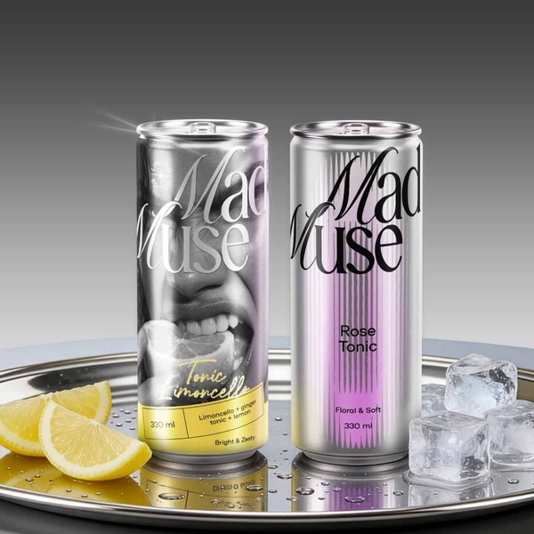
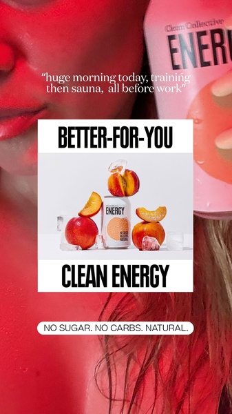
A high-end, split-screen product photography shot featuring two variations of a beverage can, one with a close-up human model element and one with a minimalist floral theme.
Free credits included. No card required
This tonic creative uses a side-by-side comparison to anchor the viewer's attention on product variety while maintaining a consistent, high-end visual language. The split-screen composition provides a dual-entry point for the audience, allowing the brand to highlight both the specific, zesty taste profile and the softer, floral notes in a single, balanced frame.
By leveraging Promer AI to analyze successful brand aesthetics, advertisers can replicate this contrast-driven layout for their own categories. This structure is effective for product lines with multiple flavor profiles because it visualizes the entire collection at once, reducing decision fatigue and driving interest through a clean, premium presentation.
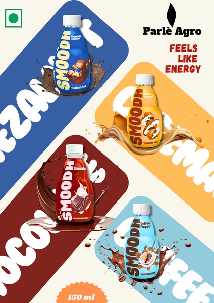
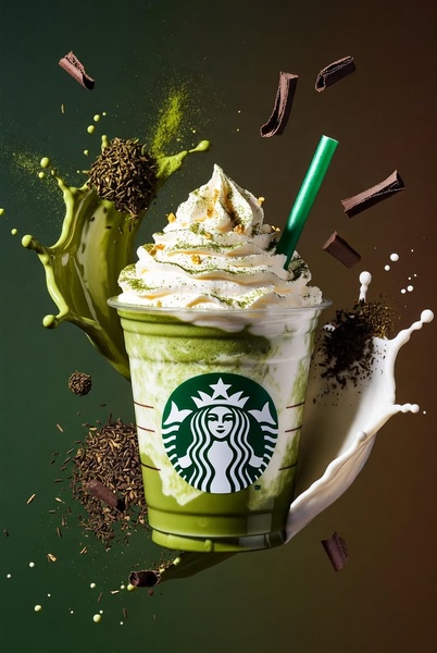
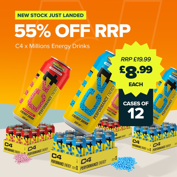
Great ads are built on a clear visual structure that simplifies the buying choice by presenting the product in its best, most contextually relevant light.
Pro tip
When using a split-screen layout for beverages, ensure that each side communicates a unique value proposition, such as 'zesty' versus 'soft', to help customers self-select their preference immediately. Keep the lighting settings consistent across both shots to ensure the final composition feels cohesive rather than disjointed.
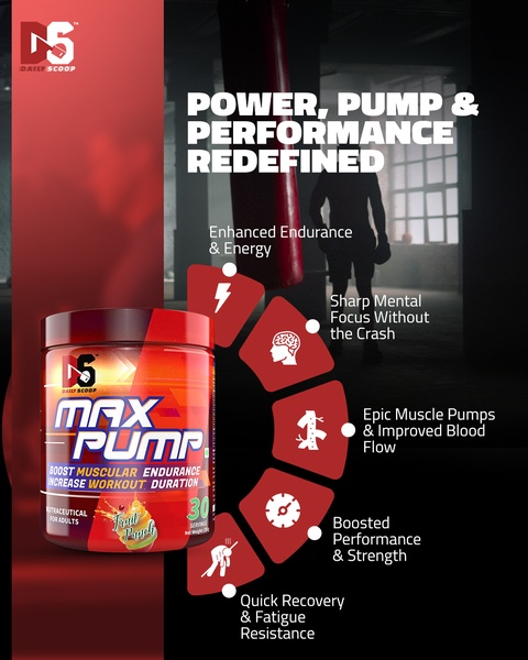
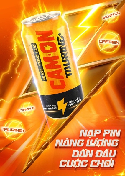
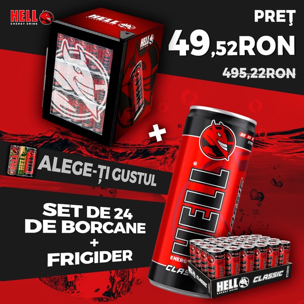






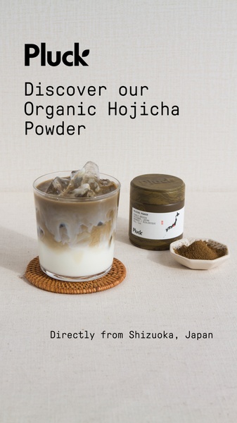
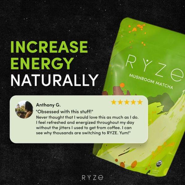
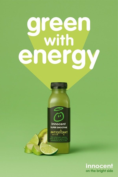
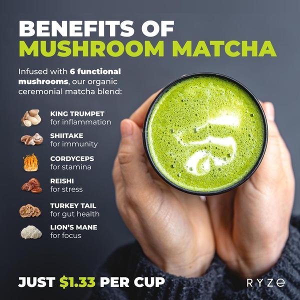
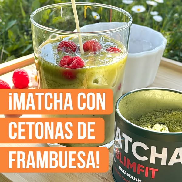
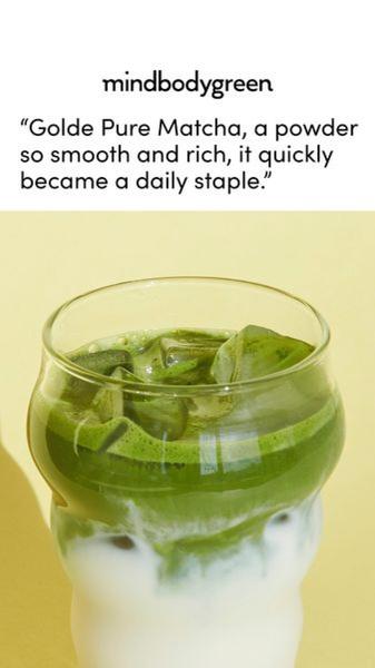
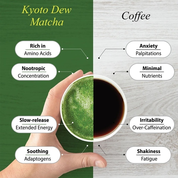
Promer helps you find the pattern, adapt it to your product, and create your own version in minutes.






