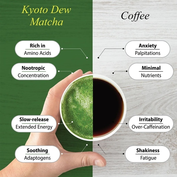
A split-screen comparison graphic showing the health and energy benefits of matcha compared to the common side effects of coffee.
Free credits included. No card required
The core of this strategy relies on a clear, visual comparison that immediately positions the matcha product as the healthier alternative to coffee. By using a split-screen layout, the ad simplifies complex health information into digestible, high-contrast takeaways that stop the scroll through sheer clarity and contrast. This structure works because it leverages a classic 'Us vs Them' psychological trigger to simplify the buyer's decision-making process by contrasting an identified pain point with a clear solution.
For most ecommerce teams, this approach removes the friction of explaining product benefits through text alone, letting the visual matrix do the heavy lifting. Using Promer AI, you can quickly replicate this information-dense visual style by organizing your own competitive advantages in a similar grid layout to maximize clarity and conversion potential.
A strong ad uses visual simplicity to turn complex functional benefits into an undeniable choice.
Pro tip
Focus on naming common, relatable pain points on the competitor side that your product demonstrably solves. Keep the text on both sides parallel—using the same number of lines for each benefit—to maintain the visual balance that makes this layout so effective.






Promer helps you find the pattern, adapt it to your product, and create your own version in minutes.






