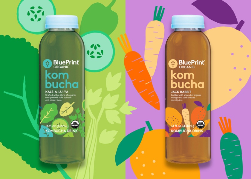
A high-contrast, side-by-side shot featuring two distinct kombucha flavors against vibrant, minimalist vector-style background illustrations.
Free credits included. No card required
This kombucha split-layout strategy works by leveraging high-contrast color blocking to create an immediate, organized visual anchor that guides the eye across two distinct product variants. By pairing the physical bottles with stylized vector illustrations of their core ingredients, the design communicates organic freshness while maintaining a clean, clutter-free aesthetic. The core effectiveness lies in the split-screen composition, which effectively doubles the product surface area while preventing the creative from feeling overwhelmed by too many graphic elements.
For most ecommerce teams, this structure is a repeatable pattern for scaling variations of a product line without needing a new photoshoot for every individual item. Using Promer AI, you can maintain this exact visual balance while swapping out your specific product bottles and brand-aligned background assets to keep your performance stable as creative fatigue sets in.
Great ads are built on a consistent visual structure that allows your product to shine through clear, intentional storytelling.
Pro tip
When using this dual-display layout, ensure your background colors are complementary but high-contrast to prevent the product from blending into the art. Keep the illustrative elements light and airy to avoid competing with the text-heavy labels on your primary product packaging.


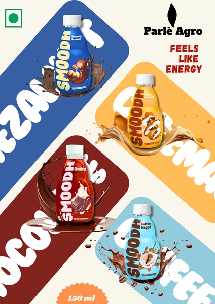

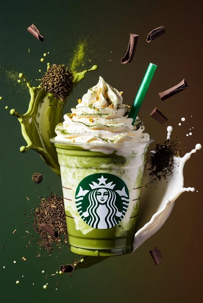


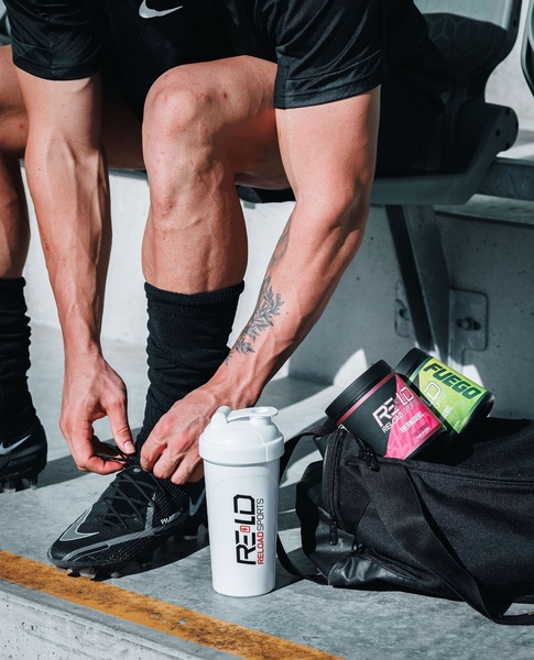
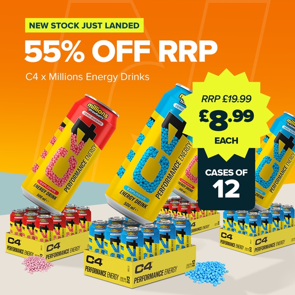
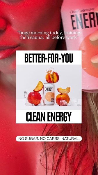
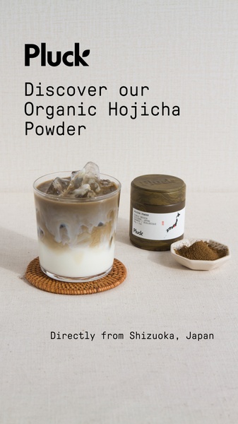
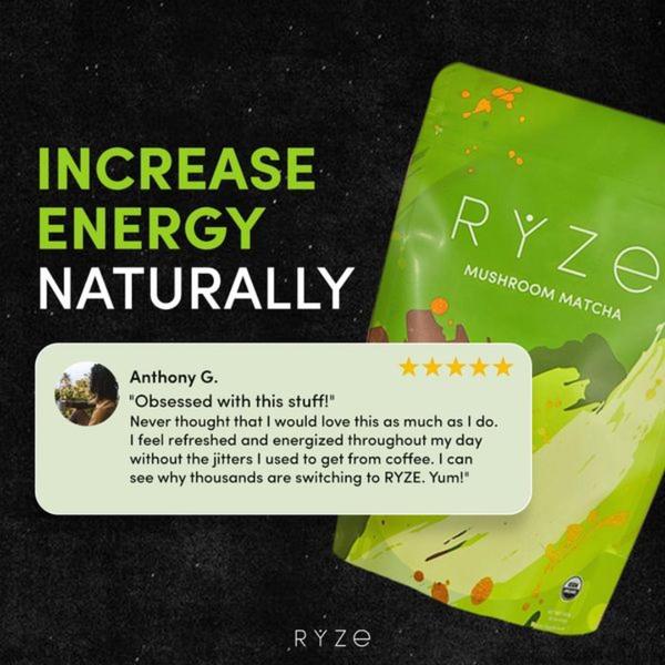
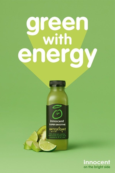


Promer helps you find the pattern, adapt it to your product, and create your own version in minutes.






